
Customizations
Configure the OpenWeb React Native SDK's appearance and behavior through the customizations API to align with your brand identity. Customize themes, comment actions, and color schemes.
Customization Settings
Comment Actions
/**
* Sets the comment actions color.
*
* @param color - The comment actions color configuration
*/
setCommentActionsColor(color: OWCommentActionsColor): void

/**
* Sets the comment actions font style.
*
* @param fontStyle - The comment actions font style configuration
*/
setCommentActionsFontStyle(fontStyle: OWCommentActionsFontStyle): void

/**
* Gets the current comment actions color.
*
* @returns The current comment actions color configuration
*/
getCommentActionsColor(): OWCommentActionsColor

/**
* Gets the current comment actions font style.
*
* @returns The current comment actions font style configuration
*/
getCommentActionsFontStyle(): OWCommentActionsFontStyle
Example
import OpenWeb, { OWCommentActionsColor, OWCommentActionsFontStyle } from 'react-native-openweb-sdk';
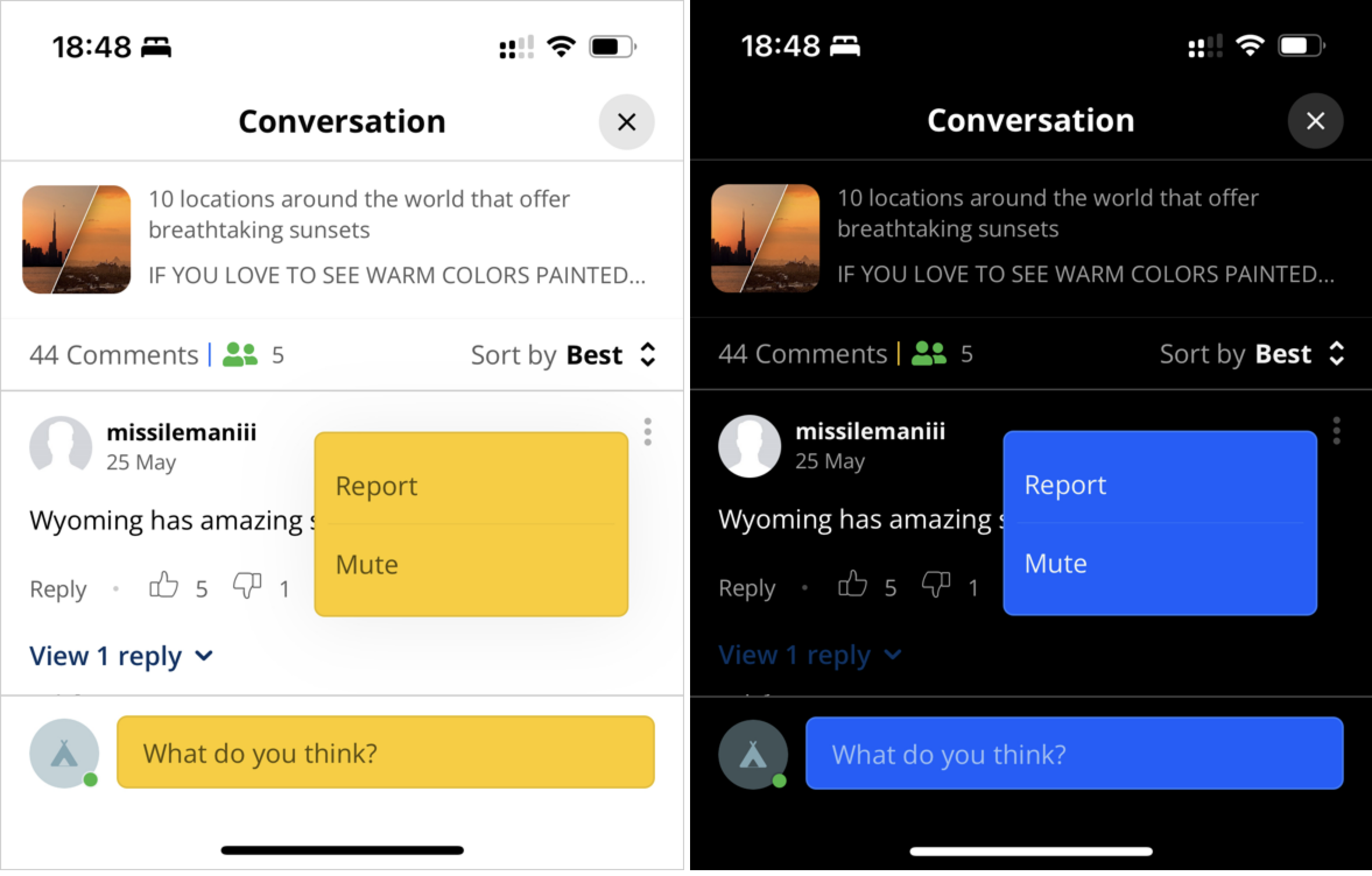
OpenWeb.manager.customizations.setCommentActionsColor({ type: OWCommentActionsColor.BrandColor });
OpenWeb.manager.customizations.setCommentActionsFontStyle({ type: OWCommentActionsFontStyle.SemiBold });
const currentFontStyle = OpenWeb.manager.customizations.getCommentActionsFontStyle();
const color = OpenWeb.manager.customizations.getCommentActionsColor();
| Property | Description |
|---|---|
| color (OWCommentActionsColor) | Color the comment actions |
| fontStyle ** (OWCommentActionsFontStyle)** | Styling of the font |
Theme Enforcement
/**
* Sets the theme enforcement mode.
*
* @param enforcement - The theme enforcement settings
*/
setThemeEnforcement(enforcement: OWThemeStyleEnforcement): void/**
* Gets the current theme enforcement mode.
*
* @returns The current theme enforcement settings
*/
getThemeEnforcement(): OWThemeStyleEnforcement
Example:
import OpenWeb, { OWThemeStyleEnforcementType, OWThemeStyle } from 'react-native-openweb-sdk';

// Example 1: Set theme enforcement to none (no enforcement)
OpenWeb.manager.customizations.setThemeEnforcement({
  type: OWThemeStyleEnforcementType.None
});

// Example 2: Set theme enforcement to dark theme
OpenWeb.manager.customizations.setThemeEnforcement({
  type: OWThemeStyleEnforcementType.Theme,
  theme: { type: OWThemeStyle.Dark }
});

// Get current theme enforcement
const enforcement = OpenWeb.manager.customizations.getThemeEnforcement();| Property | Description |
|---|---|
| enforcement (OWThemeStyleEnforcement) | Enforces either dark or light mode for the entire SDK, regardless of the device's active theme mode. |
Customized Theme
/**
* Sets the customized theme colors.
*
* @param theme - The custom theme color definitions
*/
setCustomizedTheme(theme: OWTheme): void
Example:
import { OpenWeb } from 'react-native-openweb-sdk';

// Example 1: Using 4-digit hex with alpha (#RGBA)
// The SDK supports CSS color styles.
OpenWeb.manager.customizations.setCustomizedTheme({
  brandColor: {
    lightColor: '#07AF',
    darkColor: '#0A8F'
  },
  primaryBackgroundColor: {
    lightColor: '#FFFF',
    darkColor: '#000F'
  },
  primaryTextColor: {
    lightColor: '#0009',
    darkColor: '#FFFE'
  }
});

// Example 2: Using rgb() format
OpenWeb.manager.customizations.setCustomizedTheme({
  brandColor: {
    lightColor: 'rgb(0, 122, 255)',
    darkColor: 'rgb(10, 132, 255)'
  },
  primaryBackgroundColor: {
    lightColor: 'rgb(255, 255, 255)',
    darkColor: 'rgb(0, 0, 0)'
  },
  primaryTextColor: {
    lightColor: 'rgb(51, 51, 51)',
    darkColor: 'rgb(242, 242, 247)'
  }
});

// Example 3: Using rgba() format with transparency
OpenWeb.manager.customizations.setCustomizedTheme({
  brandColor: {
    lightColor: 'rgba(0, 122, 255, 1)',
    darkColor: 'rgba(10, 132, 255, 0.9)'
  },
  primaryBackgroundColor: {
    lightColor: 'rgba(255, 255, 255, 0.95)',
    darkColor: 'rgba(0, 0, 0, 0.98)'
  },
  primaryTextColor: {
    lightColor: 'rgba(0, 0, 0, 0.87)',
    darkColor: 'rgba(255, 255, 255, 0.9)'
  }
});
| Property | Description |
|---|---|
| theme (OWTheme) | Enables granular theme customization. |
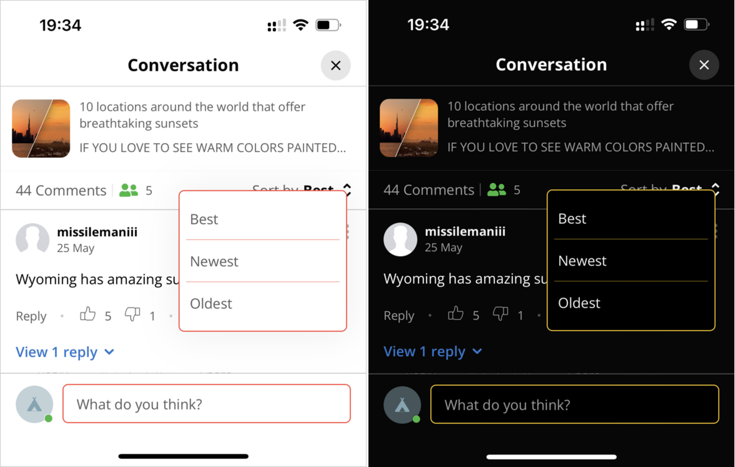
Sorting Customizations
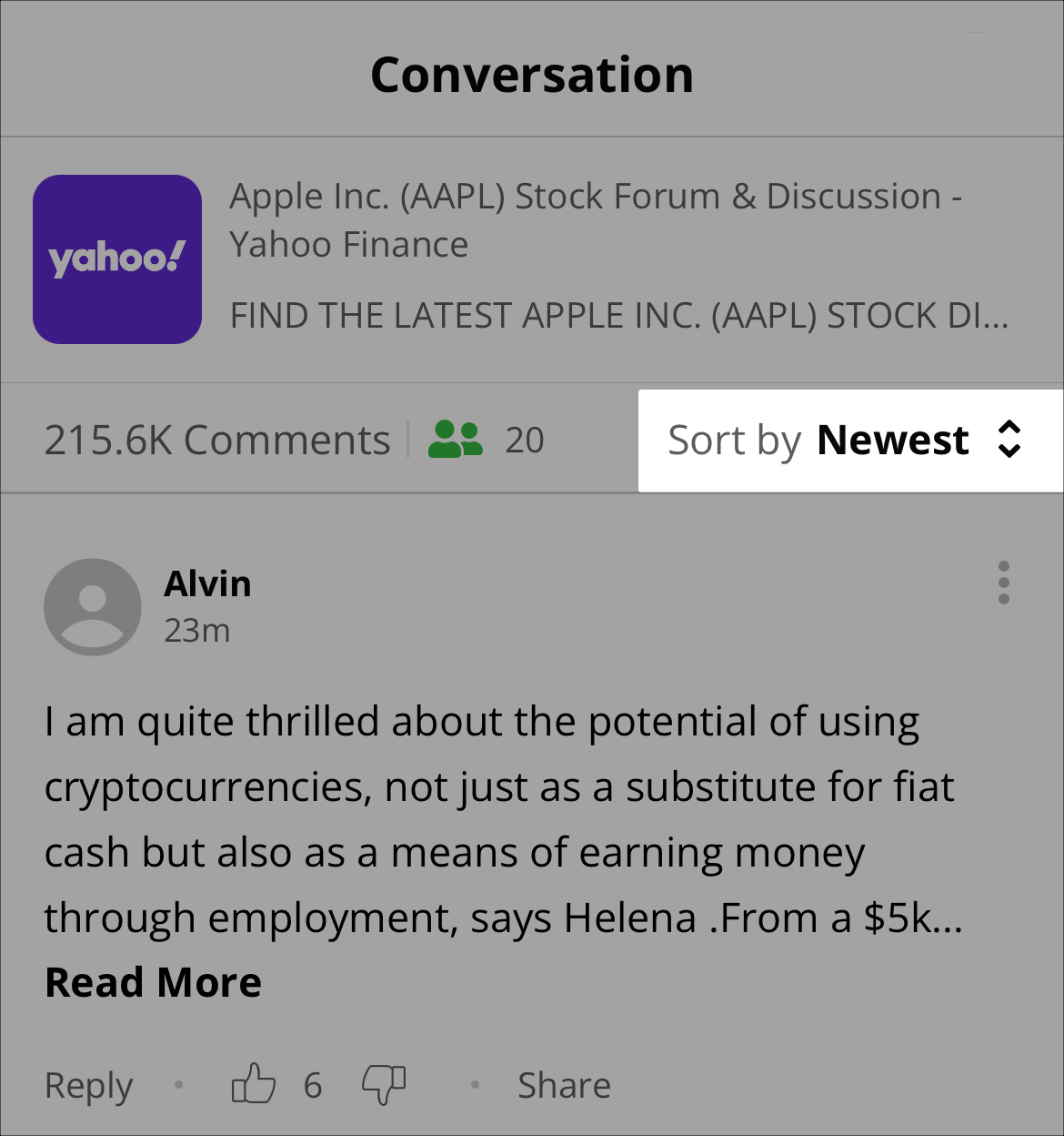
initialOption
Defines the initial sorting of comment
/**
* Sets a custom title for a sort option.
*
* @param title - The custom title to display
* @param sortOption - The sort option to customize
 */

setSortingInitialOption(initialOption: OWInitialSortStrategy): void
/**
* Gets the current initial sort strategy.
*
* @returns The current initial sort strategy
*/
getSortingInitialOption(): OWInitialSortStrategy
Example
import { OpenWeb, OWInitialSortStrategyType, OWSortOptionType } from 'react-native-openweb-sdk';

// Option 1: Use server configuration (default behavior)
OpenWeb.manager.customizations.setSortingInitialOption({
  type: OWInitialSortStrategyType.UseServerConfig,
});

// Option 2: Always start with "Newest" sort
OpenWeb.manager.customizations.setSortingInitialOption({
  type: OWInitialSortStrategyType.UseSortOption,
  sortOption: { type: OWSortOptionType.Newest },
});

// Option 3: Always start with "Best" sort
OpenWeb.manager.customizations.setSortingInitialOption({
  type: OWInitialSortStrategyType.UseSortOption,
  sortOption: { type: OWSortOptionType.Best },
});
| Setting | Description |
|---|---|
| initialOption (OWInitialSortStrategy) | Defines the initial sorting of comment |
Sorting Title
Assigns a custom name to an available sorting option.
This method enables you to align sort option names with your branding or specific regional wording
/**
* Sets a custom title for a sort option.
*
* @param title - The custom title to display
* @param sortOption - The sort option to customize
*/
setSortingTitle(title: string, sortOption: OWSortOption): void
Example
import { OpenWeb, OWSortOption } from 'react-native-openweb-sdk';

// Set custom title for "Best" sort option
OpenWeb.manager.customizations.setSortingTitle('Top Comments', {
  type: OWSortOptionType.Best
});| Setting | Description |
|---|---|
| title (string) | Custom name for the sort option. Example: "BEST!!!" |
| sortOption (OWSortOption) | Sort order option to which the custom name is applied |
Types
OWCommentActionsColor
export const OWCommentActionsColor = {
  Default: 'DEFAULT',
  BrandColor: 'BRAND_COLOR',
} as const;

export type OWCommentActionsColor =
  | { type: typeof OWCommentActionsColor.Default }
  | { type: typeof OWCommentActionsColor.BrandColor };
OWCommentActionsFontStyle
export const OWCommentActionsFontStyle = {
  Default: 'DEFAULT',
  SemiBold: 'SEMI_BOLD',
} as const;

export type OWCommentActionsFontStyle =
  | { type: typeof OWCommentActionsFontStyle.Default }
  | { type: typeof OWCommentActionsFontStyle.SemiBold };
OWThemeStyleEnforcement
export const OWThemeStyleEnforcementType = {
  None: 'none',
  Theme: 'theme',
} as const;

export type OWThemeStyleEnforcement =
  | { type: typeof OWThemeStyleEnforcementType.None }
  | { type: typeof OWThemeStyleEnforcementType.Theme; theme: OWThemeStyle };
| Property | Description |
|---|---|
| none | No theme style is enforced. |
| theme (OWThemeStyle) | Sets the theme style that is enforced. |
OWThemeStyle
export const OWThemeStyle = {
  Light: 'light',
  Dark: 'dark',
} as const;

export type OWThemeStyle =
  | { type: typeof OWThemeStyle.Light }
  | { type: typeof OWThemeStyle.Dark };
OWTheme
Defines the color to use for UI items in light (lightColor) and dark (darkColor) modes.
When customizing an
OWThemeproperty, bothlightColoranddarkColormust be defined.
The SDK supports hex colors (3, 4, 6, or 8 digits with optional # prefix) and CSS-style rgb/rgba functions
export interface OWTheme {
  skeletonColor?: OWColor;
  skeletonShimmeringColor?: OWColor;
  primarySeparatorColor?: OWColor;
  secondarySeparatorColor?: OWColor;
  tertiarySeparatorColor?: OWColor;
  primaryTextColor?: OWColor;
  secondaryTextColor?: OWColor;
  tertiaryTextColor?: OWColor;
  primaryBackgroundColor?: OWColor;
  secondaryBackgroundColor?: OWColor;
  tertiaryBackgroundColor?: OWColor;
  primaryBorderColor?: OWColor;
  secondaryBorderColor?: OWColor;
  loaderColor?: OWColor;
  brandColor?: OWColor;
  voteUpUnselectedColor?: OWColor;
  voteDownUnselectedColor?: OWColor;
  voteUpSelectedColor?: OWColor;
  voteDownSelectedColor?: OWColor;
}
OWColor
export interface OWColor {
lightColor: string;
darkColor: string;
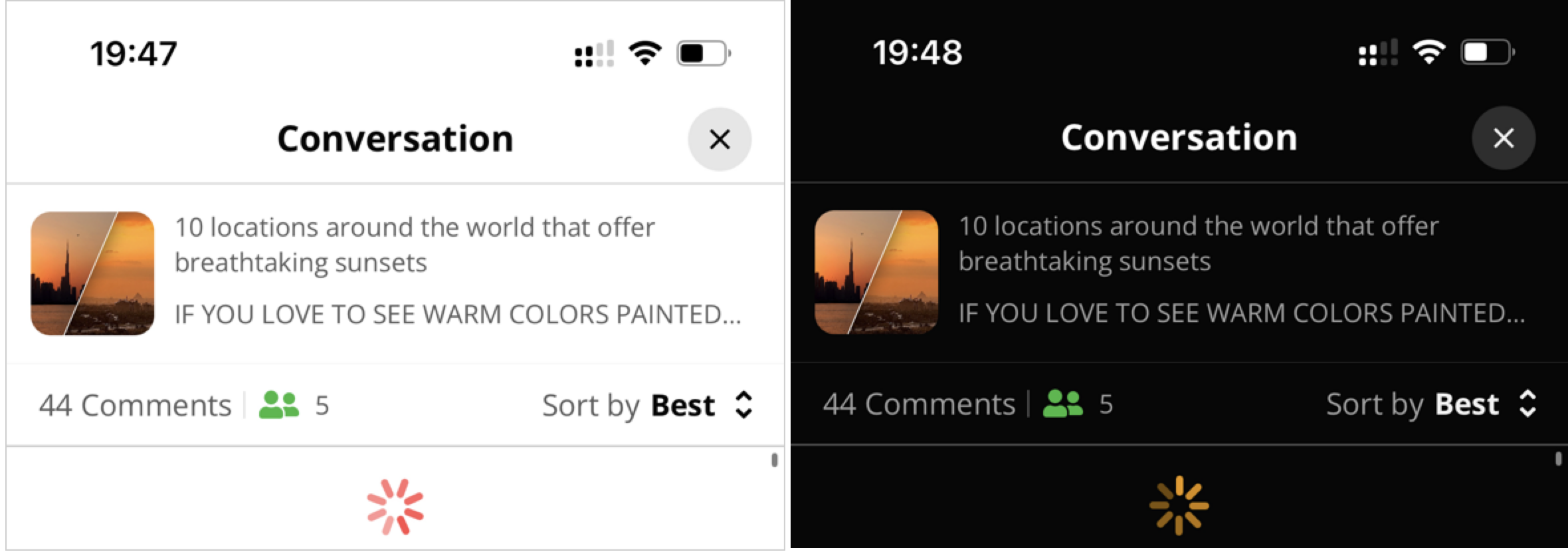
}Background Color
Light and dark theme background color customizations
| Property | Description |
|---|---|
| primaryBackgroundColor | Background color of the entire Conversation |
| secondaryBackgroundColor | Background color of secondary items: Menus, Comment entry text field |
Borders
Light and dark theme border customizations
| Property | Description |
|---|---|
| primaryBorderColor | Primary border color of the following UI elements: Comment entry field, Menus |
Brand
Light and dark theme brand color customization
| Property | Description |
|---|---|
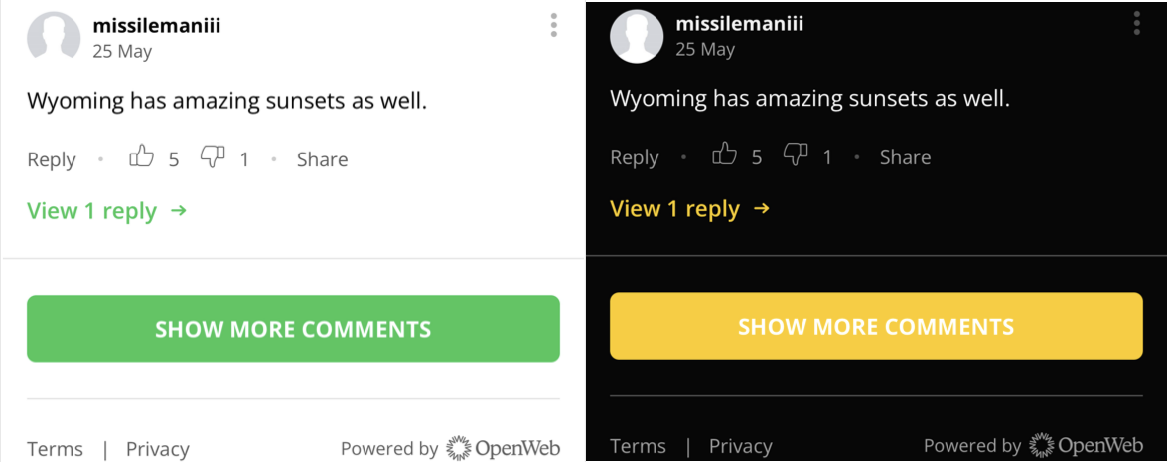
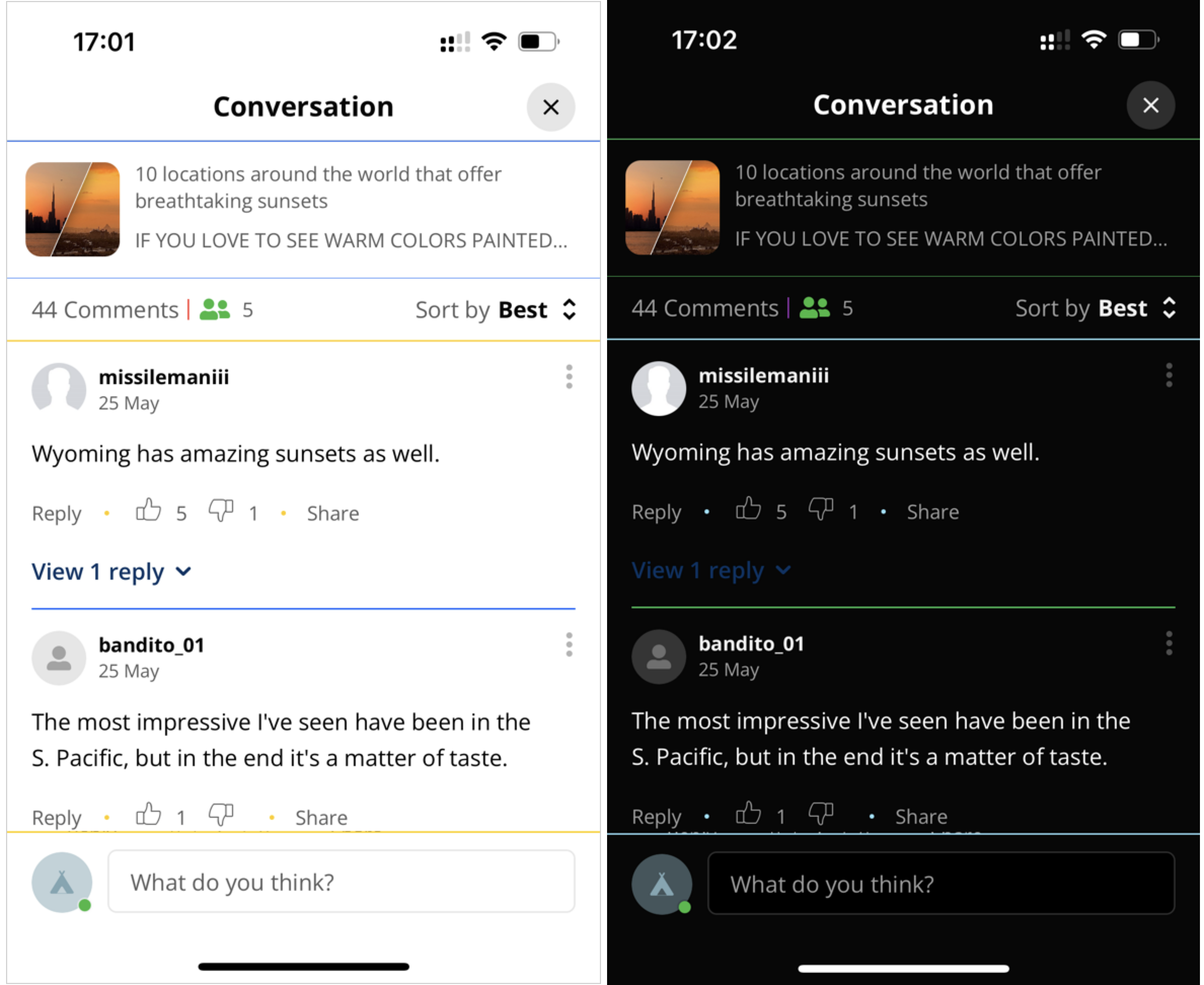
| brandColor | Primary color of the brand used in the following instances: Comment call-to-action text (View 1 reply, Collapse thread), Button background color |
Loaders
Light and dark theme loader color customization
| Property | Description |
|---|---|
| loaderColor | Color of the loading icon |
Separators
Light and dark theme separator customizations
| Property | Description |
|---|---|
| primarySeparatorColor | Color of the main separators: Directly beneath the page title, Directly beneath the Conversation snippet, Between parent messages |
| secondarySeparatorColor | Color of pipe separator between the numbers of total comments and total commenters |
| tertiarySeparatorColor | Color of the separators surrounding the comments pane: Beneath Sort by filter, Beneath last visible comment, Midline dots between Reply link and Share link |
Skeleton Color
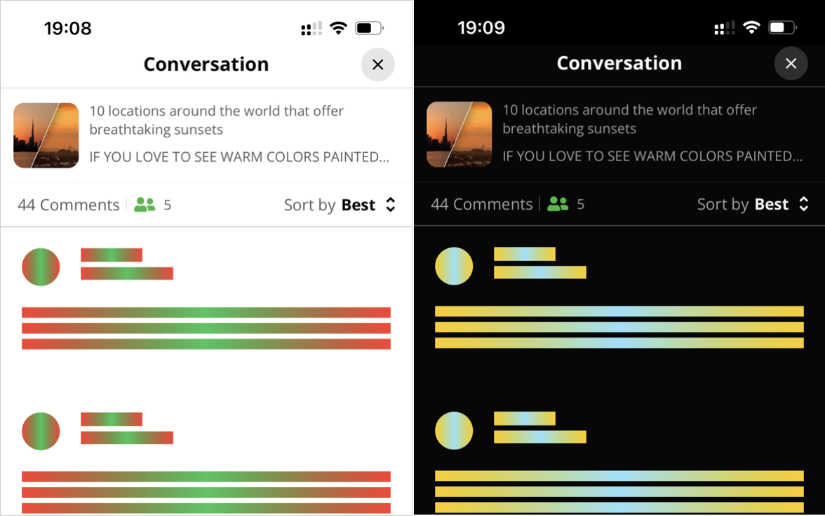
Light and dark theme skeleton customizations
| Property | Description |
|---|---|
| skeletonColor | Primary color of the UI element visual placeholder that appears while the UI element is loading |
| skeletonShimmeringColor | Secondary color used to cause the illusion of movement and shimmering. A gradient is applied with varying shades of neutral color such as gray. |
Text Color
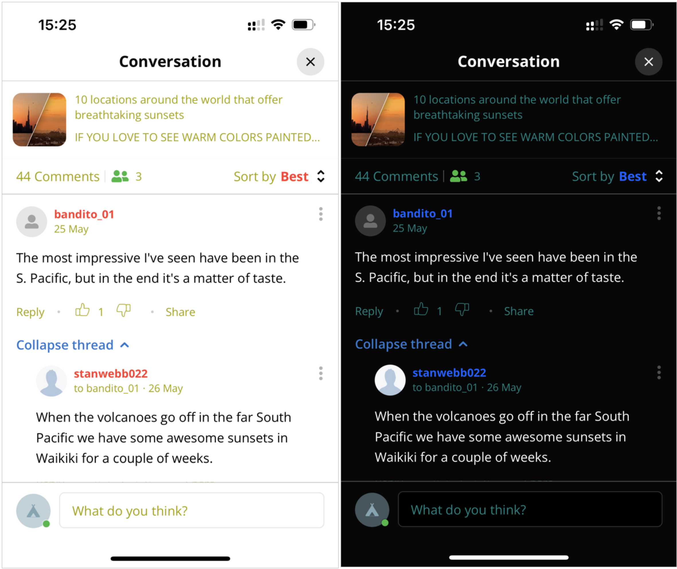
Light and dark theme text customizations
| Property | Description |
|---|---|
| primaryTextColor | Color of message text |
| secondaryTextColor | Color of username and selected Sort by option |
| tertiaryTextColor | Color of other text items: Article text, Comment date, Icons (Like, Dislike), Number of comments, Reply link, Share link, Sort by label, Text field placeholder text, Username of original commenter |
Voting Arrows
| Property | Description |
|---|---|
| voteDownSelectedColor | Color of the vote down icon when selected |
| voteDownUnselectedColor | Color of the vote down icon when not selected |
| voteUpSelectedColor | Color of the vote up icon when selected |
| voteUpUnselectedColor | Color of the vote up icon when not selected |
OWInitialSortStrategy
export const OWInitialSortStrategyType = {
  UseServerConfig: 'useServerConfig',
  UseSortOption: 'useSortOption',
} as const;

export type OWInitialSortStrategy =
  | { type: typeof OWInitialSortStrategyType.UseServerConfig }
  | {
      type: typeof OWInitialSortStrategyType.UseSortOption;
      sortOption: OWSortOptionType;
    };
Updated 4 months ago