Reactions
Empower your readers to express how they feel.
Reactions open the door to a more spontaneous, emotional engagement with your content.

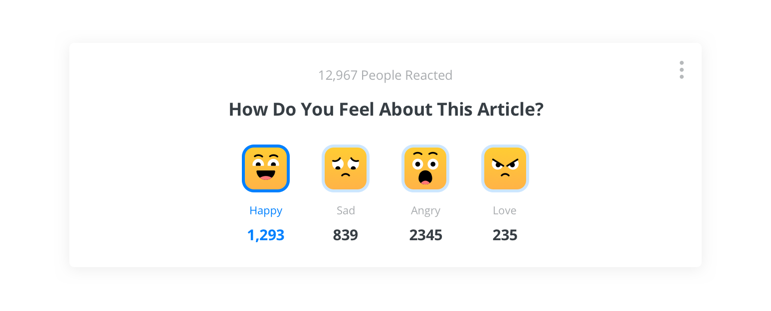
Reactions default theme
OpenWeb's Reactions functionality opens a native environment to engage readers when they decide to engage. Additionally, Reactions enables you to monetize your content by exposing your readers to advertising.
Requirement
Before you enable this feature, contact your OpenWeb PSM to set up a monetization campaign for your implementation.
Implementation Options
OpenWeb provides you several approaches to add Reactions to your site. Each is listed in the following table.
| Approach | Description |
|---|---|
| Custom Location | Allows you to choose the location of Reactions on a page. |
Custom Location
When using this implementation method, you can choose where Reactions appears on a page.
To add Reactions, use the following steps:
- In your OpenWeb Admin Panel, click Features > Reactions.
- Under Enable/Disable Reactions, click the toggle to Enabled.
- From the Choose Reactions Location dropdown menu, select Manual Code Integration.
- (Optional) Under Reactions Themes, on the Default card, click Edit to update the Default theme or a custom theme that was previously created. You can also click Create New Theme to create a custom theme.
- Click Save & Publish.
- On your page, add the Reactions positioning
<div>in the desired page location.
The following table lists the different approaches for aligning Reactions with the layout of your page.
| Orientation | Code |
|---|---|
| Horizontal* | <div data-spotim-app="reactions" data-post-id="POST_ID"></div> |
| Vertical | <div data-spotim-app="reactions" data-post-id="POST_ID" data-vertical-view="true"></div> |
- When embedding Reactions on a page without other OpenWeb products, add the launcher code.
Theme Customizations
Edit the default theme
You can customize the default Reactions theme to align with branding of your site.

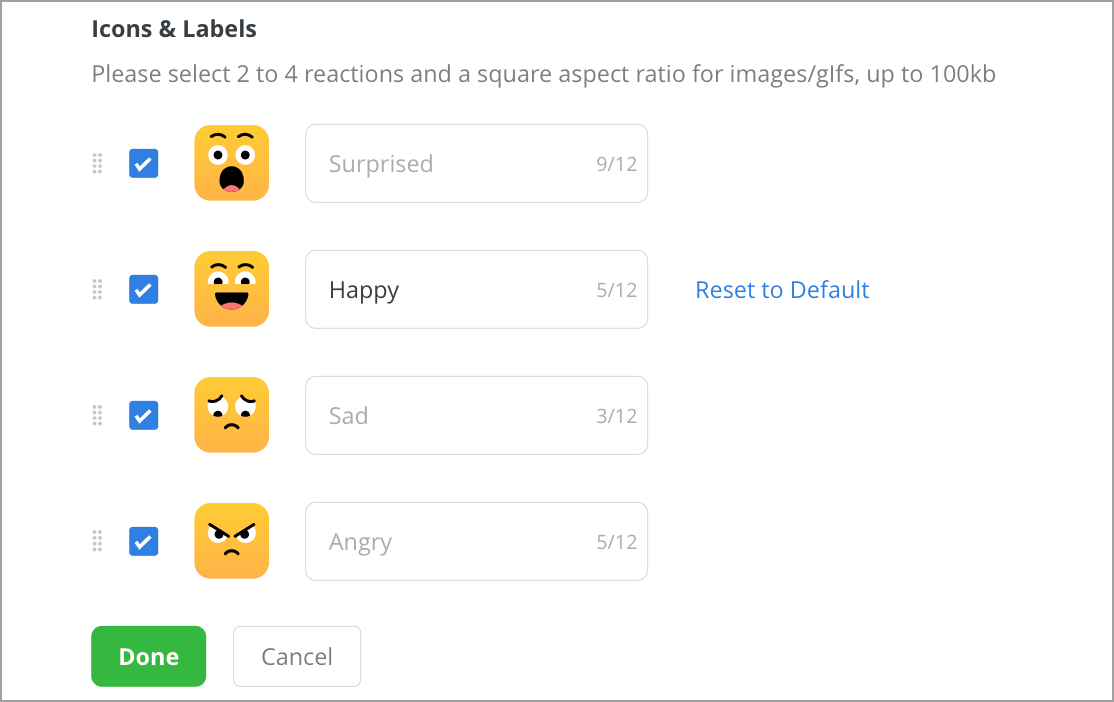
Icons & Labels section of a Reactions theme
Use the following steps to customize the default theme:
- On the default theme card, click Edit. The Reactions Theme popup window appears.
- In the Reaction Title field, enter a question for your readers to react to, such as How Do You Feel About This Article?.
- Under Icons & Labels, choose 2-4 reaction icons. Click the checkbox next to an icon to select or deselect it.
- Click the icon image to upload a custom icon. A custom icon must be meet the following requirements:
- File type: .gif, .jpg, .png
- Aspect ratio: Square (1:1)
- File size: ≤ 100kb
- Click in the field next to an icon to enter a new icon label that has ≤ 12 characters.
- Click
 at the end of an icon row and drag to reorder the icon in the list.
 - Click Done.
Create a new theme
You can create additional Reactions themes to align with certain article topics or the branding of certain sections of your site.

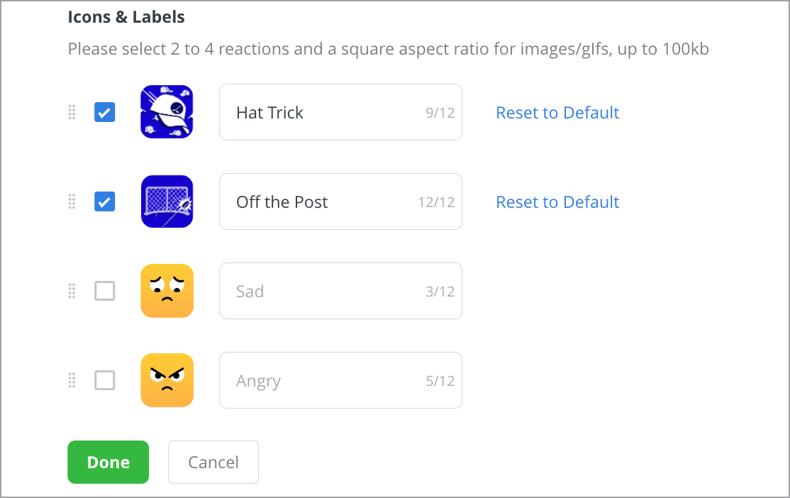
Icons & Labels section of a Reactions theme
Use the following steps to create a new theme:
- Click Create New Theme. The Reactions Theme popup window appears.
- In the Theme Name field, enter a unique name for the new theme.
The theme name is used to identify the theme in the Admin Console and to select the specific theme for the Manual Code Integration method. Therefore, the theme name should not include spaces or special characters.
- From the Implementation Method dropdown menu, select an implementation method. Each method is explained in the following table.
Implementation Method | Description |
|---|---|
Default (Related Keyword) | Automatically deploys the Reactions theme on all articles with topics that match those specified in the Keywords textbox |
Manual Code Integration (Theme) | Enables custom deployment of the Reactions theme by adding the |
- If Default (Related Keyword) has been selected, enter at least one keyword in the Keywords textbox.
- In the Reaction Title field, enter a question for your readers to react to, such as How Do You Feel About This Article?.
- Under Icons & Labels, choose 2-4 reaction icons. Click the checkbox next to an icon to select or deselect it.
- Click the icon image to upload a custom icon. A custom icon must be meet the following requirements:
- File type: .gif, .jpg, .png
- Aspect ratio: Square (1:1)
- File size: ≤ 100kb
- Click in the field next to an icon to enter a new icon label that has ≤ 12 characters.
- Click
 at the end of an icon row and drag to reorder the icon in the list.
 - Click Done.
Updated 6 months ago
