
Customizations
Configure the OpenWeb iOS SDK's appearance and behavior through the OWCustomizations protocol to align with your brand identity. Customize colors, fonts, navigation, and UI elements.
With the OpenWeb SDK's OWCustomizations protocol, you can craft a unique, unified appearance that aligns with your brand's identity.

Through OWCustomizations, you can achieve the following:
- Modify the sort settings of comments through the
OWSortingCustomizationsprotocol or aligning sort option names with specific branding terminology - Customize individual UI elements — fonts, font weights, and colors — through the
elementsproperty - Tailor UI elements, such as headers and navigation, through the
OWCustomizableElementCallbackcallback
public protocol OWCustomizations {
    var fontFamily: OWFontGroupFamily { get set }
    var sorting: OWSortingCustomizations { get }
    var themeEnforcement: OWThemeStyleEnforcement { get set }
    var statusBarEnforcement: OWStatusBarEnforcement { get set }
    var navigationBarEnforcement: OWNavigationBarEnforcement { get set }
    var elements: OWCustomizationElements { get set }

    func addElementCallback(_ callback: @escaping OWCustomizableElementCallback)

    // Deprecated:
    var commentActions: OWCommentActionsCustomizations { get set }
    var customizedTheme: OWTheme { get set }
}
Elements
The elements property provides granular customization of individual UI elements: fonts, font weights, and colors.
Usage
let elements: OWCustomizations = OpenWeb.manager.ui.customizations.elements

elements.navigationTitle.fontFamily = "Avenir"
elements.navigationTitle.fontWeight = .bold

elements.commentBody.color = UIColor(lightColor: .black, darkColor: .white)
elements.commenterName.color = .gray
All properties are optional and default to nil, meaning the SDK uses its built-in defaults for any property you don't set.
Light / Dark Mode
Color properties accept a UIColor. To provide different colors for light and dark mode, use the SDK's convenience initializer:
UIColor(lightColor: UIColor, darkColor: UIColor)OWCustomizationElements
public struct OWCustomizationElements {
    // Text elements (font + color)
    public var navigationTitle: OWCustomizationTextElement
    public var commenterName: OWCustomizationTextElement
    public var commentBody: OWCustomizationTextElement
    public var inputText: OWCustomizationTextElement
    public var avatarText: OWCustomizationTextElement
    public var commentActions: OWCustomizationTextElement

    // Color elements
    public var subtitle: OWCustomizationElement
    public var detail: OWCustomizationElement
    public var background: OWCustomizationElement
    public var overlayBackground: OWCustomizationElement
    public var cardBackground: OWCustomizationElement
    public var border: OWCustomizationElement
    public var sectionDivider: OWCustomizationElement
    public var contentDivider: OWCustomizationElement
    public var divider: OWCustomizationElement
    public var skeletonGradientEdge: OWCustomizationElement
    public var skeletonGradientCenter: OWCustomizationElement
    public var loader: OWCustomizationElement
    public var brand: OWCustomizationElement
    public var voteUpSelected: OWCustomizationElement
    public var voteDownSelected: OWCustomizationElement
    public var voteUpUnselected: OWCustomizationElement
    public var voteDownUnselected: OWCustomizationElement
}
Text Elements
| Property | Description |
|---|---|
navigationTitle | Title shown in the navigation bar |
commenterName | User display name on comments |
commentBody | Comment text content |
inputText | Text input fields (compose comment) |
avatarText | Initials shown in avatar placeholders |
commentActions | Action buttons (Reply, Share, etc.) |
Color Elements
| Property | Description |
|---|---|
subtitle | Secondary text (timestamps, metadata) |
detail | Tertiary text (less prominent details) |
background | Primary background |
overlayBackground | Modal/overlay backgrounds |
cardBackground | Card/surface backgrounds |
border | Border color |
sectionDivider | Thick dividers between sections |
contentDivider | Medium dividers between content blocks |
divider | Thin/subtle dividers |
skeletonGradientEdge | Skeleton loading animation edge color |
skeletonGradientCenter | Skeleton loading animation center color |
loader | Loading indicator |
brand | Brand accent color |
voteUpSelected | Upvote button (selected) |
voteDownSelected | Downvote button (selected) |
voteUpUnselected | Upvote button (unselected) |
voteDownUnselected | Downvote button (unselected) |
Visual Examples
Background Color
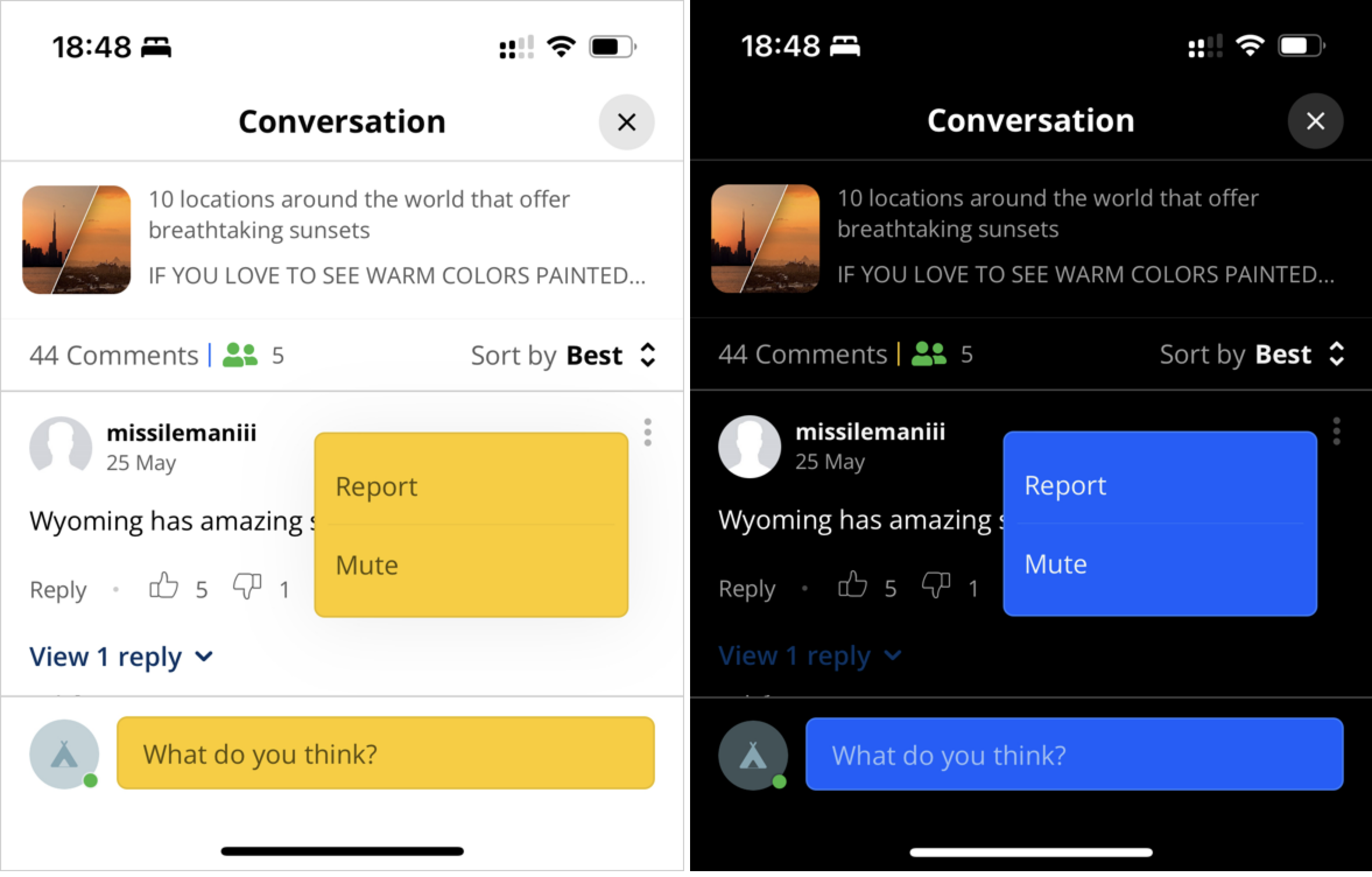
background and overlayBackground element color customizations
let elements = OpenWeb.manager.ui.customizations.elements
elements.background.color = UIColor(lightColor: .white, darkColor: .black)
elements.overlayBackground.color = UIColor(lightColor: .yellow, darkColor: .blue)| Property | Description |
|---|---|
| background | Primary background |
| overlayBackground | Modal/overlay backgrounds |
Borders
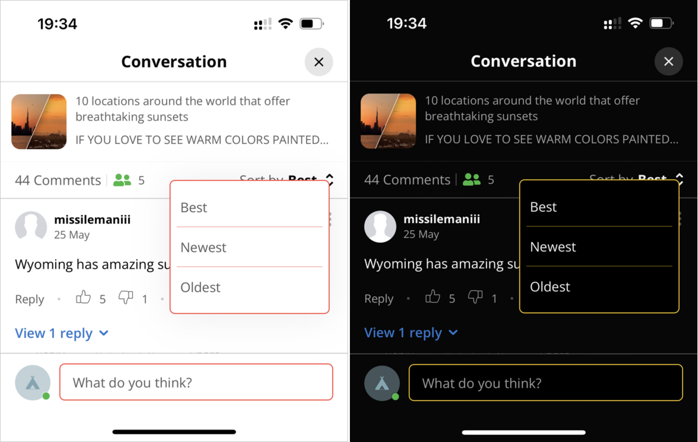
border element color customization
let elements = OpenWeb.manager.ui.customizations.elements
elements.border.color = UIColor(lightColor: .red, darkColor: .yellow)| Property | Description |
|---|---|
| border | Border color |
Brand
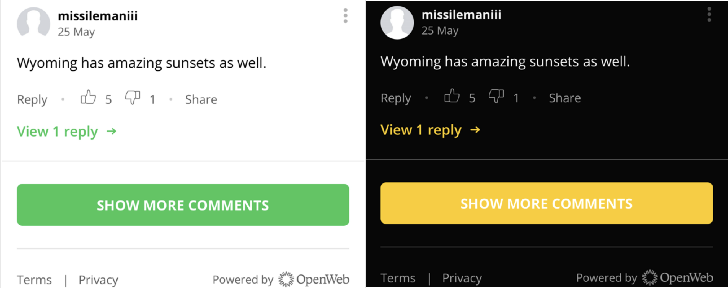
brand element color customization
let elements = OpenWeb.manager.ui.customizations.elements
elements.brand.color = UIColor(lightColor: .green, darkColor: .yellow)| Property | Description |
|---|---|
| brand | Brand accent color |
Loaders
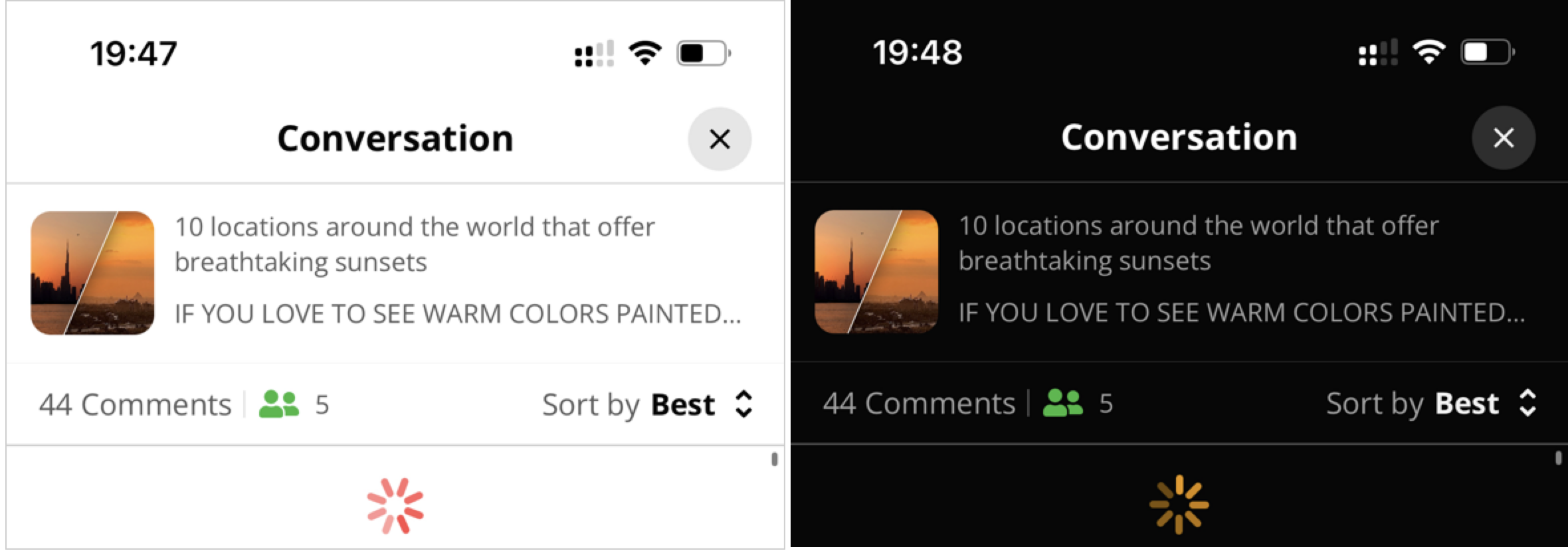
loader element color customization
let elements = OpenWeb.manager.ui.customizations.elements
elements.loader.color = UIColor(lightColor: .red, darkColor: .yellow)| Property | Description |
|---|---|
| loader | Loading indicator |
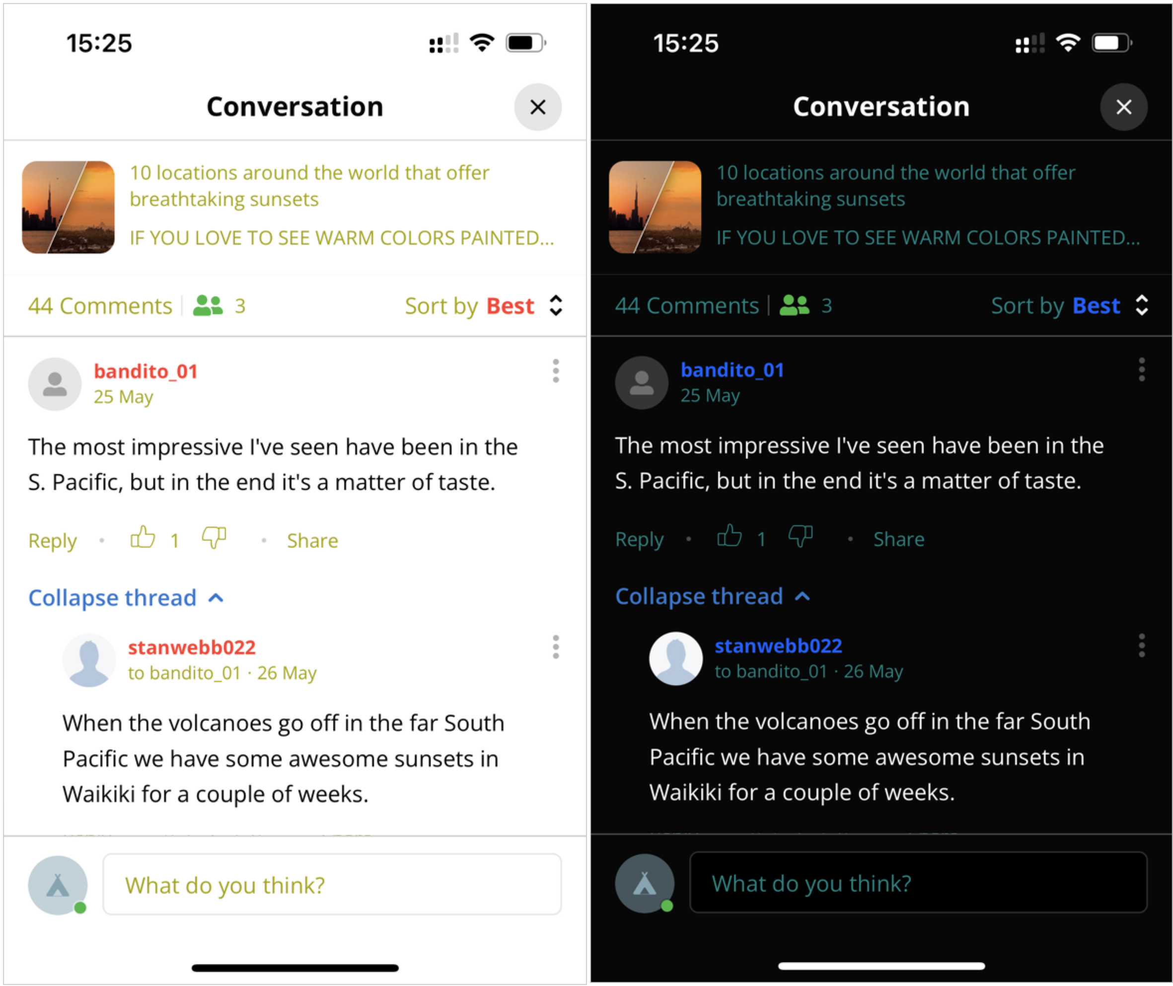
Separators
sectionDivider, contentDivider, and divider element color customizations
let elements = OpenWeb.manager.ui.customizations.elements
elements.sectionDivider.color = UIColor(lightColor: .blue, darkColor: .green)
elements.contentDivider.color = UIColor(lightColor: .red, darkColor: .purple)
elements.divider.color = UIColor(lightColor: .yellow, darkColor: .teal)| Property | Description |
|---|---|
| sectionDivider | Thick dividers between sections |
| contentDivider | Medium dividers between content blocks |
| divider | Thin/subtle dividers |
Skeleton Color
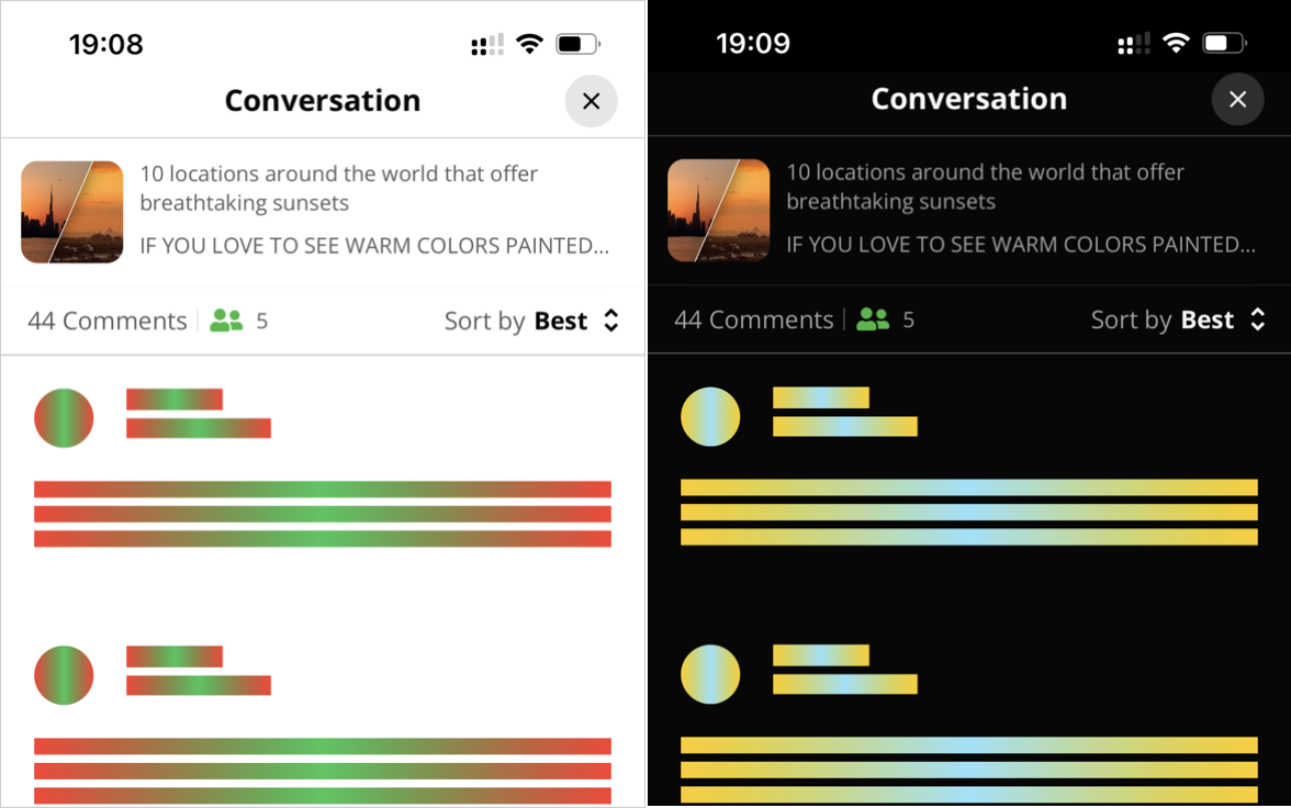
skeletonGradientEdge and skeletonGradientCenter element color customizations
let elements = OpenWeb.manager.ui.customizations.elements
elements.skeletonGradientEdge.color = UIColor(lightColor: .red, darkColor: .yellow)
elements.skeletonGradientCenter.color = UIColor(lightColor: .green, darkColor: .teal)| Property | Description |
|---|---|
| skeletonGradientEdge | Skeleton loading animation edge color |
| skeletonGradientCenter | Skeleton loading animation center color |
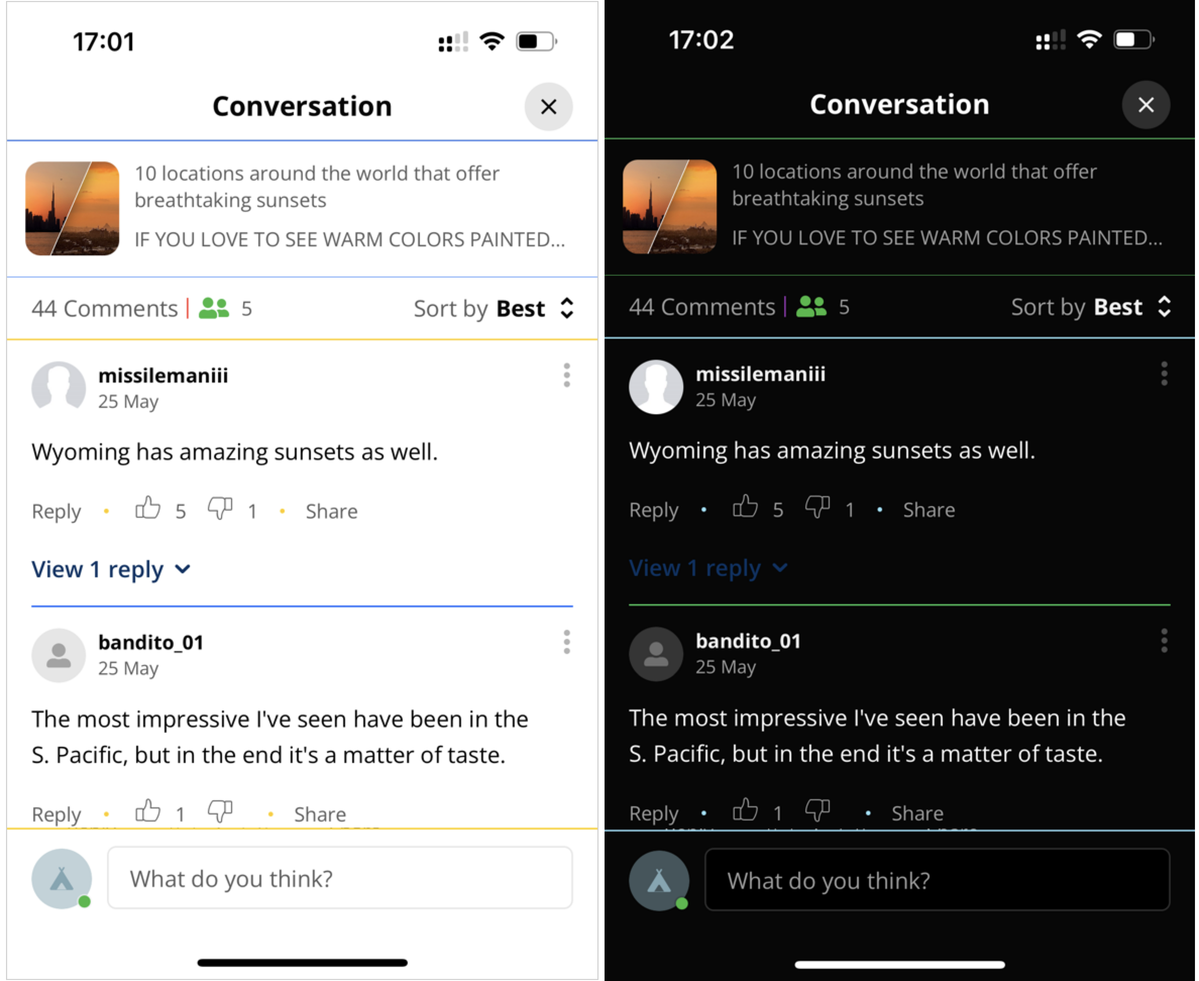
Text Color
commentBody, subtitle, and detail element color customizations
let elements = OpenWeb.manager.ui.customizations.elements
elements.commentBody.color = UIColor(lightColor: .black, darkColor: .white)
elements.subtitle.color = UIColor(lightColor: .red, darkColor: .blue)
elements.detail.color = UIColor(lightColor: .yellow, darkColor: .teal)| Property | Description |
|---|---|
| commentBody | Comment text content |
| subtitle | Secondary text (selected sort option, pre-conversation text, empty state title) |
| detail | Tertiary text (article description, "Sort by" label, notification dates) |
Voting Arrows
let elements = OpenWeb.manager.ui.customizations.elements
elements.voteUpUnselected.color = UIColor(lightColor: UIColor, darkColor: UIColor)
elements.voteDownUnselected.color = UIColor(lightColor: UIColor, darkColor: UIColor)
elements.voteUpSelected.color = UIColor(lightColor: UIColor, darkColor: UIColor)
elements.voteDownSelected.color = UIColor(lightColor: UIColor, darkColor: UIColor)| Property | Description |
|---|---|
| voteUpSelected | Upvote button (selected) |
| voteDownSelected | Downvote button (selected) |
| voteUpUnselected | Upvote button (unselected) |
| voteDownUnselected | Downvote button (unselected) |
Migration from OWTheme and OWCommentActionsCustomizations
OWTheme and OWCommentActionsCustomizations are deprecated and will be removed in version 4.0.0. Use elements instead. For detailed property mapping tables and code examples, see:
Customization Settings
Fonts
let customizations: OWCustomizations = OpenWeb.manager.ui.customizations

customizations.fontFamily = OWFontGroupFamily| Setting | Description |
|---|---|
| OWFontGroupFamily OWFontGroupFamily | Defines the UI font. See: OWFontGroupFamily |
Refer to Custom Fonts for more details.
Navigation Bar Enforcement
let customizations: OWCustomizations = OpenWeb.manager.ui.customizations

customizations.navigationBarEnforcement = OWNavigationBarEnforcement| Property | Description |
|---|---|
| OWNavigationBarEnforcement OWNavigationBarEnforcement | Defines the navigation bar appearance to enforce. See: OWNavigationBarEnforcement |
Sorting
The OWSortingCustomizations protocol defines the sort settings for the comments within the user interface.
let customizations: OWCustomizations = OpenWeb.manager.ui.customizations

let sorting: OWSortingCustomizations = customizations.sorting
sorting.setTitle("BEST!!!" , forOption: .best)
sorting.initialOption = .use(sortOption:.newest)
initialOption
Defines the initial sorting of comments
sorting.initialOption = .use(sortOption: OWSortOption)| Setting | Description |
|---|---|
| .use(sortOption: OWSortOption) | Permits defining the initial sort order of the comments shown in the user interface |
| .useServerConfig | Uses the sort order defined in the Admin Panel |
setTitle()
Assigns a custom name to an available sorting option
This method enables you to align sort option names with your branding or specific regional wording.
setTitle(_ title: String , forOption option: OWSortOption)| Argument | Description |
|---|---|
| title | Custom name for the sort option. Example: "BEST!!!" |
| option | Sort order option to which the custom name is applied |
Status Bar Enforcement
When customizing the status bar style, the following steps must be completed prior to theme enforcement:
- In the info.plist file, set View controller-based status bar appearance to YES.
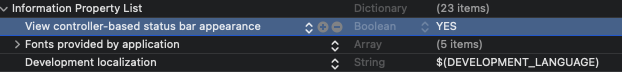
info.plist settings
- To support status bar style customization when
presentionalMode: .push(navigationController: UINavigationController)is set in a flows approach, subclassUINavigationControllerand incorporate the following code.class HostApplicationNavigationController: UINavigationController { override var preferredStatusBarStyle: UIStatusBarStyle { return topViewController?.preferredStatusBarStyle ?? .default } }
let customizations: OWCustomizations = OpenWeb.manager.ui.customizations

customizations.statusBarEnforcement = OWStatusBarEnforcement| Property | Description |
|---|---|
| OWStatusBarEnforcement OWStatusBarEnforcement | Defines the status bar appearance to enforce. See: OWStatusBarEnforcement |
Theme Enforcement
let customizations: OWCustomizations = OpenWeb.manager.ui.customizations

customizations.themeEnforcement = OWThemeStyleEnforcement| Property | Description |
|---|---|
| OWThemeStyleEnforcement OWThemeStyleEnforcement | Enforces either dark or light mode for the entire SDK, regardless of the device's active theme mode. See: OWThemeStyleEnforcement |
UI Customization
The SDK allows you to customize UI elements.
let customizations: OWCustomizations = OpenWeb.manager.ui.customizations

let customizableClosure: OWCustomizableElementCallback = { element, source, style, postId in
    switch element {
      case .communityQuestion(let textView):
        // Do your customizations to the text view
      case .default:
        break
    }
}
customizations.addElementCallback(customizableClosure) // Allow multiple callbacks| Setting | Description |
|---|---|
| OWCustomizableElementCallback OWCustomizableElementCallback | Callback for defining a user interface component to customize. See: OWCustomizableElementCallback |
Enumerations
OWCommentActionsColor
Deprecated in 3.0.0. Useelements.commentActions.colorinstead. Will be removed in 4.0.0.
| Setting | Description |
|---|---|
| OWCommentActionsFontStyle OWCommentActionsFontStyle | Options for the color. Possible Values:
|
OWCommentActionsFontStyle
Deprecated in 3.0.0. Useelements.commentActions.fontWeightinstead. Will be removed in 4.0.0.
| Setting | Description |
|---|---|
| OWCommentActionsFontStyle OWCommentActionsFontStyle | Options for font style. Possible Values:
|
OWCustomizableElement
| Setting | Description |
|---|---|
| OWCustomizableElement OWCustomizableElement | UI component to customize. Possible Values:
|
OWArticleDescriptionCustomizableElement
| Setting | Description |
|---|---|
| OWArticleDescriptionCustomizableElement OWHeaderCustomizableElement | Options for customization. Possible Values:
|
OWCommentCreationCTACustomizableElement
| Setting | Description |
|---|---|
| OWCommentCreationCTACustomizableElement OWCommentCreationCTACustomizableElement | Options for customization. Possible Values:
|
OWCommentingEndedCustomizableElement
| Setting | Description |
|---|---|
| OWCommentingEndedCustomizableElement OWCommentingEndedCustomizableElement | Options for customization. Possible Values:
|
OWCommunityGuidelinesCustomizableElement
| Setting | Description |
|---|---|
| OWCommunityGuidelinesCustomizableElement OWCommunityGuidelinesCustomizableElement | Options for customization. Possible Values:
|
OWCommunityQuestionCustomizableElement
| Setting | Description |
|---|---|
| OWCommunityQuestionCustomizableElement OWCommunityQuestionCustomizableElement | Options for customization. Possible Values:
|
OWEmptyStateCommentingEndedCustomizableElement
| Setting | Description |
|---|---|
| OWEmptyStateCommentingEndedCustomizableElement OWEmptyStateCommentingEndedCustomizableElement | Options for customization. Possible Values:
|
OWEmptyStateCustomizableElement
| Setting | Description |
|---|---|
| OWEmptyStateCustomizableElement OWEmptyStateCustomizableElement | Options for customization. Possible Values:
|
OWHeaderCustomizableElement
| Setting | Description |
|---|---|
| OWHeaderCustomizableElement OWHeaderCustomizableElement | Options for customization. Possible Values:
|
OWLoginPromptCustomizableElement
| Setting | Description |
|---|---|
| OWLoginPromptCustomizableElement OWNavigationCustomizableElement | Options for customizing the login prompt. Possible Values:
|
OWNavigationCustomizableElement
| Setting | Description |
|---|---|
| OWNavigationCustomizableElement OWNavigationCustomizableElement | Options for customization. Possible Values:
|
OWOnlineUsersCustomizableElement
| Setting | Description |
|---|---|
| OWOnlineUsersCustomizableElement OWSummaryHeaderCustomizableElement | Options for customization. Possible Values:
|
OWSummaryCustomizableElement
| Setting | Description |
|---|---|
| OWSummaryCustomizableElement OWSummaryCustomizableElement | Options for customization. Possible Values:
|
OWSummaryHeaderCustomizableElement
| Setting | Description |
|---|---|
| OWSummaryHeaderCustomizableElement OWSummaryHeaderCustomizableElement | Options for customization. Possible Values: .
|
OWCustomizableElementCallback
typealias OWCustomizableElementCallback = (
  element: OWCustomizableElement,
  sourceType: OWViewSourceType,
  style: OWThemeStyle,
  postId: String?
) -> Void

customizations.addElementCallback(customizableClosure)| Argument | Description |
|---|---|
| element OWCustomizableElement | User interface component to customize. See: OWCustomizableElement |
| postId string | Unique article identifier that is specific to the article page. Ideal postId:
|
| sourceType OWViewSourceType | Location of the user interface element. See: OWViewSourceType |
| style OWThemeStyle | Theme to apply to the element. See: OWThemeStyle |
OWCustomizationElement
Customizes color for a non-text UI element.
public struct OWCustomizationElement {
    public var color: UIColor?
}| Property | Type | Description |
|---|---|---|
color | UIColor? | Element color. Use UIColor(lightColor:darkColor:) for dynamic colors. |
OWCustomizationTextElement
Customizes font and color for a text UI element.
public struct OWCustomizationTextElement {
    public var fontFamily: String?
    public var fontWeight: UIFont.Weight?
    public var color: UIColor?
}| Property | Type | Description |
|---|---|---|
fontFamily | String? | Font family name (e.g. "Avenir", "Georgia") |
fontWeight | UIFont.Weight? | Font weight (e.g. .regular, .bold, .semibold) |
color | UIColor? | Text color. Use UIColor(lightColor:darkColor:) for dynamic colors. |
OWFontGroupFamily
| Setting | Description |
|---|---|
| OWFontGroupFamily OWFontGroupFamily | Options to set the UI font. Possible Values:
|
OWNavigationBarEnforcement
| Setting | Description |
|---|---|
| OWNavigationBarEnforcement OWNavigationBarEnforcement | Style of navigation bar to enforce. Possible Values:
|
OWNavigationBarStyle
| Setting | Description |
|---|---|
| OWNavigationBarStyle OWNavigationBarStyle | Navigation bar style options. Possible Values:
|
OWSortOption
| Setting | Description |
|---|---|
| OWSortOption string | Options for sorting comments. Possible Values:
|
OWStatusBarEnforcement
| Setting | Description |
|---|---|
| OWStatusBarEnforcement OWStatusBarEnforcement | Style of status bar to enforce. Possible Values:
|
OWThemeStyle
| Setting | Description |
|---|---|
| OWThemeStyle string | Options for theme styles. Possible Values:
|
OWThemeStyleEnforcement
customizations.themeEnforcement = .theme(_ theme: OWThemeStyle)| Property | Description |
|---|---|
| .none | No theme style is enforced |
| .theme(_ theme: OWThemeStyle) | Sets the theme style that is enforced. See: OWThemeStyle |
OWViewSourceType
| Setting | Description |
|---|---|
| OWViewSourceType string | Options for a user interface location when customizing UI elements. Possible Values: .
|
Updated 2 months ago