
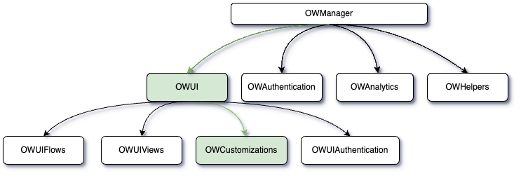
Customization
The Customizations section of the OpenWeb Android SDK lets you tailor the SDK's UI to align with your brand identity. As of SDK version 3.0.0, OWCustomizationElements is the primary surface for per-element styling. Older APIs (OWTheme, OWCommentActionsCustomizations, setCustomUIDelegate) remain available but are deprecated and scheduled for removal in 4.0.0.
interface OWCustomizations {
    // Current API
    val elements: OWCustomizationElements
    val notifications: OWNotificationsCustomizations
    val fontFamily: OWFontGroupFamily
    val sorting: OWSortingCustomizations
    val themeEnforcement: OWThemeStyleEnforcement
    fun setGiphyProvider(giphyProvider: SpotGiphyProvider)
    fun setUseWhiteNavigationColor(useWhiteNavigationColor: Boolean)

    // Deprecated — removed in 4.0.0
    var commentActions: OWCommentActionsCustomizations
    var customizedTheme: OWTheme
    fun setCustomUIDelegate(customUIDelegate: CustomUIDelegate)
    fun setAccessoryViewProvider(viewProvider: OWAccessoryViewProvider?): OWAccessoryViewManager
}
Elements
NEW in 3.0.0. The elements property exposes per-element customizations for fonts, colors, and view-level callbacks. Each element is pre-initialized — mutate properties directly, don't reassign.
val elements = OpenWeb.manager.ui.customizations.elements

elements.navigationTitle.color = UIColor(lightColor = Color.BLACK, darkColor = Color.WHITE)
elements.navigationTitle.fontFamily = "serif"
elements.navigationTitle.fontWeight = OWFontWeight.SEMI_BOLD

elements.commentBody.color = UIColor(lightColor = Color.DKGRAY, darkColor = Color.LTGRAY)
elements.background.color = UIColor(lightColor = Color.WHITE, darkColor = Color.BLACK)
Light / Dark Mode Colors
Color properties accept a UIColor (aliased as OWColor) that holds separate values for light and dark mode:
UIColor(lightColor = Color.WHITE, darkColor = Color.BLACK)Element Capability Tiers
| Type | Capabilities |
|---|---|
OWCustomizationElement | color only |
OWCustomizationTextElement | color, fontFamily, fontWeight |
OWCustomizationCustomTextElement | color, fontFamily, fontWeight, customizeView callback |
OWCustomizationViewElement<V> | customizeView callback only |
The customizeView callback receives the resolved view and an OWCustomizationContext (isDarkModeEnabled, postId) so you can apply context-aware styling. The callback runs after declarative properties (color/fontFamily/fontWeight) have been applied.
elements.navigationBackIcon.customizeView = { imageView, ctx ->
    imageView.setColorFilter(if (ctx.isDarkModeEnabled) Color.WHITE else Color.BLACK)
}
Text + Callback Elements
OWCustomizationCustomTextElement — color, font family, font weight, and a customizeView callback.
| Element | Description |
|---|---|
navigationTitle | Title in the navigation bar |
loginPrompt | Login prompt text for unauthenticated users |
communityQuestion | Community question text |
communityGuidelines | Community guidelines text |
sayControlPreConversation | "Say something" control in Pre-Conversation |
sayControlConversation | "Say something" control in Conversation |
preConversationHeaderText | Header text in Pre-Conversation |
preConversationHeaderCounter | Counter text in the Pre-Conversation header |
preConversationHeaderUserCount | User count in the Pre-Conversation header |
commenterName | Commenter display name |
readOnlyText | Read-only mode text |
emptyStateReadOnlyText | Empty-state text in read-only mode |
conversationCommentCount | Comment count in Conversation |
conversationUserCount | User count in Conversation |
conversationSortText | Sort label in Conversation |
conversationSortDropdownItem | Sort dropdown item text |
Text Style Elements
OWCustomizationTextElement — color, font family, and font weight.
| Element | Description |
|---|---|
commentActions | Action buttons (Reply, Share, etc.) |
commentBody | Comment text content |
inputText | Text input field (comment creation) |
avatarText | Initials shown in avatar placeholders |
View Callback Elements
OWCustomizationViewElement<V> — callback access only. Used for heterogeneous view types where a single color field has no well-defined semantics.
| Element | View Type |
|---|---|
navigationBackIcon | ImageView |
navigationToolbar | Toolbar |
showCommentsButton | Button |
commentCreationActionButton | View |
commentCreationActionImageButton | ImageButton |
conversationFooter | ViewGroup |
conversationInfoLayout | ViewGroup |
conversationSortSpinner | AppCompatSpinner |
Color Elements
OWCustomizationElement — color only.
| Element | Description |
|---|---|
background | Primary background |
cardBackground | Card/surface backgrounds |
overlayBackground | Modal/overlay backgrounds |
border | Border color |
subtitle | Secondary text (timestamps, metadata) |
detail | Tertiary text (less prominent details) |
sectionDivider | Thick dividers between sections |
contentDivider | Medium dividers between content blocks |
divider | Thin/subtle dividers |
loader | Loading indicator color |
brand | Brand accent color |
skeletonGradientEdge | Skeleton loading edge color |
skeletonGradientCenter | Skeleton loading center color |
voteUpSelected | Upvote button (selected) |
voteDownSelected | Downvote button (selected) |
voteUpUnselected | Upvote button (unselected) |
voteDownUnselected | Downvote button (unselected) |
For font weight values, see the Custom Fonts page.
Notifications
NEW in 3.0.0. Configure push notification tap behaviour and custom sound through OWNotificationsCustomizations.
val notifications = OpenWeb.manager.ui.customizations.notifications

notifications.tapIntent = Intent(this, MainActivity::class.java)
notifications.sound = Uri.parse("android.resource://com.example.app/raw/notification_sound")| Property | Description |
|---|---|
tapIntent: Intent? | Intent launched when a notification is tapped. If null, the SDK uses default behaviour. |
sound: Uri? | Custom notification sound. Consumed during notification-channel creation. |
Important: Set sound before the SDK creates its notification channel. Android does not allow changing the channel sound after the channel has been created.
For notification tap handling and routing into a conversation, see Push Notifications.
Sorting
Sorting options let you customize the initial sorting order and labels for comment threads.
Properties and Methods
-
initialSortOption: Specifies the default sorting order. Possible values include:
BEST: (Default).NEWESTOLDEST
-
setTitle(title: String, sortOption: OWSortOption): Assigns a custom title for a sort option.
Example:
val sortingCustomizations: OWSortingCustomizations = OpenWeb.manager.ui.customizations.sorting

// Set the default sorting option to NEWEST
sortingCustomizations.initialSortOption = OWSortOption.NEWEST

// Customize the title for "BEST"
sortingCustomizations.setTitle("Top Comments", OWSortOption.BEST)
Theme
With the OpenWeb SDK, you can define light, dark, or fully customized themes to match your application's design.
Theme Enforcement
Theme Enforcement allows developers to set the theme mode and customize the color scheme for dark mode.
Properties and Methods
-
isSupportSystemDarkMode: Controls whether the SDK should follow the system's dark mode setting.true(default) - The SDK will respect the device's system dark mode setting.false- The SDK will use the explicitly setthemeModeregardless of system settings.
-
themeMode: Defines the theme mode. Options include:-
LIGHT(default) -
DARK
-
-
darkColor: Allows setting a custom dark color scheme.
Example:
val customizations = OpenWeb.manager.ui.customizations

// Enable dark mode
customizations.themeEnforcement.themeMode = OWThemeMode.DARK
Customized Theme
Deprecated in 3.0.0.customizedThemeand theOWThemeproperties are replaced by semanticelements. They will be removed in 4.0.0. For mapping see the Migration Guide.
Customized Theme provides complete control over colors for both light and dark modes. Developers can specify colors for various UI components using the OWTheme class.
Warning
When customizing an OWTheme property, both
lightColoranddarkColormust be defined.
Example:
customizations.customizedTheme = OWTheme(
    primaryBackgroundColor = UIColor(0xFF000000),
    secondaryTextColor = UIColor(0xFF888888),
    brandColor = UIColor(0xFFFF5722)
)
OWTheme
| Property | Description |
|---|---|
skeletonColor | Color for loading skeletons. |
skeletonShimmeringColor | Shimmer effect color for loading skeletons. |
primarySeparatorColor | Primary separator line color. |
secondarySeparatorColor | Secondary separator line color. |
tertiarySeparatorColor | Tertiary separator line color. |
primaryTextColor | Primary text color for main content. |
secondaryTextColor | Secondary text color for supporting content. |
tertiaryTextColor | Tertiary text color for less prominent content. |
primaryBackgroundColor | Background color for primary views. |
secondaryBackgroundColor | Background color for secondary views. |
tertiaryBackgroundColor | Background color for tertiary views. |
primaryBorderColor | Border color for primary elements. |
secondaryBorderColor | Border color for secondary elements. |
loaderColor | Color of loading indicators. |
brandColor | Brand's primary color. |
voteUpSelectedColor | Color for the "upvote" button when selected. |
voteUpUnselectedColor | Color for the "upvote" button when unselected. |
voteDownSelectedColor | Color for the "downvote" button when selected. |
voteDownUnselectedColor | Color for the "downvote" button when unselected. |
statusBarColor (deprecated) | Status bar color. Deprecated in API level 35; use primaryBackgroundColor. |
navigationBarColor (deprecated) | Navigation bar color. Deprecated in API level 35; use primaryBackgroundColor. |
Comment Action
Deprecated in 3.0.0. Useelements.commentActions(color,fontFamily,fontWeight) instead. Will be removed in 4.0.0.
Control the appearance of comment action buttons, such as their colors and fonts.
Properties and Methods
-
commentActionsButtonsColor: Options include:
DEFAULTBRAND_COLOR
-
commentActionsButtonsFont: Options include:
DEFAULTSEMI_BOLD
Example:
val customizations = OpenWeb.manager.ui.customizations

// Customize comment action buttons
customizations.commentActions = OWCommentActionsCustomizations(
    commentActionsButtonsColor = CommentActionsButtonsColor.BRAND_COLOR,
    commentActionsButtonsFont = CommentActionsButtonsFont.SEMI_BOLD
)
Font Family
Customize the font style used throughout the SDK's UI components.
Property
- fontFamily: Represents a font style resource ID that can be applied globally to text elements in the SDK.
Example:
val customizations = OpenWeb.manager.ui.customizations

// Set a custom font family
customizations.fontFamily.styleResId = R.font.my_custom_font
Note: For per-element font customization, see Custom Fonts.
Accessory Views
Deprecated.setAccessoryViewProviderhas not functioned since 2.4.0 and will be removed in 4.0.0.
Extend or replace predefined UI elements using accessory views.
Method
- setAccessoryViewProvider(viewProvider: OWAccessoryViewProvider): Registers a custom view provider for the SDK.
Example:
customizations.setAccessoryViewProvider(object : OWAccessoryViewProvider {
    override fun provideView(
        viewType: OWAccessoryViewType,
        inflater: LayoutInflater,
        parent: ViewGroup?
    ): View? {
        if (viewType == OWAccessoryViewType.BottomToolbar) {
            return inflater.inflate(R.layout.custom_toolbar, parent, false)
        }
        return null
    }
})
Giphy Integration
Enable users to select and share GIFs using the Giphy SDK.
Method
- setGiphyProvider(giphyProvider: SpotGiphyProvider): Connects the OpenWeb SDK with the Giphy SDK.
Example:
customizations.setGiphyProvider(object : SpotGiphyProvider {
    override fun configure(activityContext: Context, sdkKey: String) {
        // Giphy configuration logic
    }

    override fun showGiphyDialogFragment(
        giphySetting: GiphySetting,
        fragmentManager: FragmentManager,
        fragmentTag: String,
        selectionListener: GifSelectionListener
    ) {
        // Show the Giphy dialog fragment
    }
})
Custom UI Delegate
Deprecated in 3.0.0.setCustomUIDelegate+CustomizableViewTypeare replaced by per-elementcustomizeViewcallbacks onOWCustomizationCustomTextElementandOWCustomizationViewElement. Will be removed in 4.0.0.
You can customize individual UI components by implementing a custom delegate.
Method
- setCustomUIDelegate(customUIDelegate: CustomUIDelegate): Allows customization of specific views within the SDK.
Example:
customizations.setCustomUIDelegate(object : CustomUIDelegate {
    override fun customizeView(
        viewType: CustomizableViewType,
        view: View,
        isDarkModeEnabled: Boolean,
        postId: OWPostId
    ) {
        if (viewType == CustomizableViewType.NAVIGATION_TITLE_TEXT_VIEW) {
            (view as? TextView)?.apply {
                text = "Custom Navigation Title"
                setTextColor(Color.RED)
            }
        }
    }
})
CustomizableViewType
| View Type | Description |
|---|---|
LOGIN_PROMPT_TEXT_VIEW | Customizes the login prompt text displayed for unauthenticated users. |
SAY_CONTROL_IN_PRE_CONVERSATION_TEXT_VIEW | Customizes the "Say something" control in the pre-conversation view. |
SAY_CONTROL_IN_CONVERSATION_TEXT_VIEW | Customizes the "Say something" control in the conversation view. |
CONVERSATION_FOOTER_VIEW | Customizes the footer section of the conversation. |
COMMUNITY_QUESTION_TEXT_VIEW | Customizes the community question text view. |
NAVIGATION_TITLE_TEXT_VIEW | Customizes the navigation title text. |
NAVIGATION_BACK_IMAGE_VIEW | Customizes the back button image in the navigation bar. |
NAVIGATION_TOOLBAR_VIEW | Customizes the entire navigation toolbar. |
COMMUNITY_GUIDELINES_TEXT_VIEW | Customizes the community guidelines text. |
SHOW_COMMENTS_BUTTON | Customizes the "Show Comments" button. |
PRE_CONVERSATION_HEADER_TEXT_VIEW | Customizes the header text in the pre-conversation view. |
PRE_CONVERSATION_HEADER_COUNTER_TEXT_VIEW | Customizes the counter text in the pre-conversation header. |
COMMENT_CREATION_ACTION_BUTTON | Customizes the action button for creating comments. |
COMMENT_CREATION_ACTION_IMAGE_BUTTON | Customizes the image button for creating comments. |
READ_ONLY_TEXT_VIEW | Customizes the text view displayed in read-only mode. |
EMPTY_STATE_READ_ONLY_TEXT_VIEW | Customizes the text view displayed when there are no comments in read-only mode. |
CONVERSATION_SORT_TEXT_VIEW | Customizes the text view displayed for the sort action. |
CONVERSATION_SORT_SPINNER_VIEW | Customizes the spinner view that displays the sort options. |
PRE_CONVERSATION_HEADER_USER_COUNT_TEXT_VIEW | Customizes the text view displayed for the user count in pre conversation header. |
CONVERSATION_USER_COUNT_TEXT_VIEW | Customizes the text view displayed for the user count in conversation. |
CONVERSATION_COMMENT_COUNT_TEXT_VIEW | Customizes the text view that displayed for the comment count in conversation. |
CONVERSATION_USERNAME_TEXT_VIEW | Customizes the text view that displayed for the user name in conversation. |
Navigation Bar Color
- setUseWhiteNavigationColor(useWhiteNavigationColor: Boolean): Configures the navigation bar color to white.
Example:
customizations.setUseWhiteNavigationColor(true)Migrating from 2.x
For step-by-step migration from OWTheme and OWCommentActionsCustomizations to the new elements API, see the Migration Guide.
Updated 30 days ago