Customization options
Change default settings to enhance your brand

The OpenWeb iOS SDK allows you to customize the appearance of different app features to create a seamless UI and branding experience for your users.
Site color and avatar style
From your Admin Dashboard, you can configure the following elements:
- Style of the avatars displayed in a Conversation
- Color of the Show More Comments button in the Pre-Conversation
ViewController - Color of the title of your company's admin users
Use the following steps to customize the site color and avatar style:
- From your OpenWeb Admin Dashboard, click Settings > DESIGN.
- In the Site Color section, choose a color. The color you choose is the color of the Show More Comments button in the Pre-Conversation
ViewControllerand the title of your company's admin users. - In the Avatars Style section, select one of the avatar schemes.
User experience
The iOS SDK allows you to customize aspects of the conversation user experience, such as the theme, article settings, and comment sort order.
Sort order
You can change the conversation's initial sort order of comments.
Change initial sort type
let sortOption = SpotImSortByOption.newest
SpotIm.setInitialSort(option: sortOption)
Argument | Description |
|---|---|
| Type of sort order
|
Customize the text for sorting options
// Method signature
setCustomSortByOptionText(option: SpotImSortByOption, text: String)

// SpotImSortByOption enum
enum SpotImSortByOption {
    case best
    case newest
    case oldest
}

// Example
SpotIm.setCustomSortByOptionText(option: .best, text: "CustomTitle")
Color theme
OpenWeb supports a dark mode theme with a default gray background color. To set the background color to match the parent app you can use the following API.
SpotIm.darkModeBackgroundColor = UIColor.PARENT_APP_DARK_THEME_BACKGROUND_COLORBy default, the system theme will be set to the SDK. If your app supports overriding the system settings manually, you can use the following overrideUserInterfaceStyle API to set it manually to the SDK as well.
SpotIm.overrideUserInterfaceStyle = SPUserInterfaceStyle.darkCurrent article details
Please contact your PSM to learn more about comment labels and request setting remote configure related to comment sections and labels info.
When custom labels are set up in the config, call set section name in SpotImArticleMetadata with a custom section name to enable or override the existing default section.
let articleMetadata = SpotImArticleMetadata(url: "URL TO THE ARTICLE PAGE ON THE WEB",
                                            title: "ARTICLE TITLE",
                                            subtitle: "ARTICLE SUBTITLE",
                                            thumbnailUrl: "URL TO ARTICLE THUMBNAIL IMAGE",
                                            section: "SECTION NAME"
)

spotIMCoordinator?.preConversationController(
    withPostId: "POST ID",
    articleMetadata: articleMetadata,
    numberOfPreLoadedMessages: 2, // This is optional, Default = 2, Maximum = 15
    navigationController: navigationController,
    completion: { [weak self] preConversationVC in
    // add preConversationVC to your view controller
  }
)
In the following scenarios, SpotImArticleMetadata should not be called:
- If the default comment label section is set up in the config, comment labels will be enabled on all Conversations. There is no need to set the section name in
SpotImArticleMetadata. - If the comment label config is not set up, setting the section name in
SpotImArticleMetadatawill have no effect.
Article header visibility
The displayArticleHeader setting allows you to determine whether an article header is displayed. By default, an article header with the article thumbnail, title, and subtitle is presented above the full Conversation and commenting UI.
SpotIm.displayArticleHeader = true|falseRead-only status
You can set comments to read-only for a specific article.
let articleMetadata = SpotImArticleMetadata(... ,readOnlyMode: SpotImReadOnlyMode.default)Argument | Description |
|---|---|
| State of read-only mode
|
// Method signature
public init(url: String,
            title: String,
            subtitle: String,
            thumbnailUrl: String,
            section: String = "default",
            customBIData: [String :String]? = nil,
            readOnlyMode: SpotImReadOnlyMode = .default)
UI elements
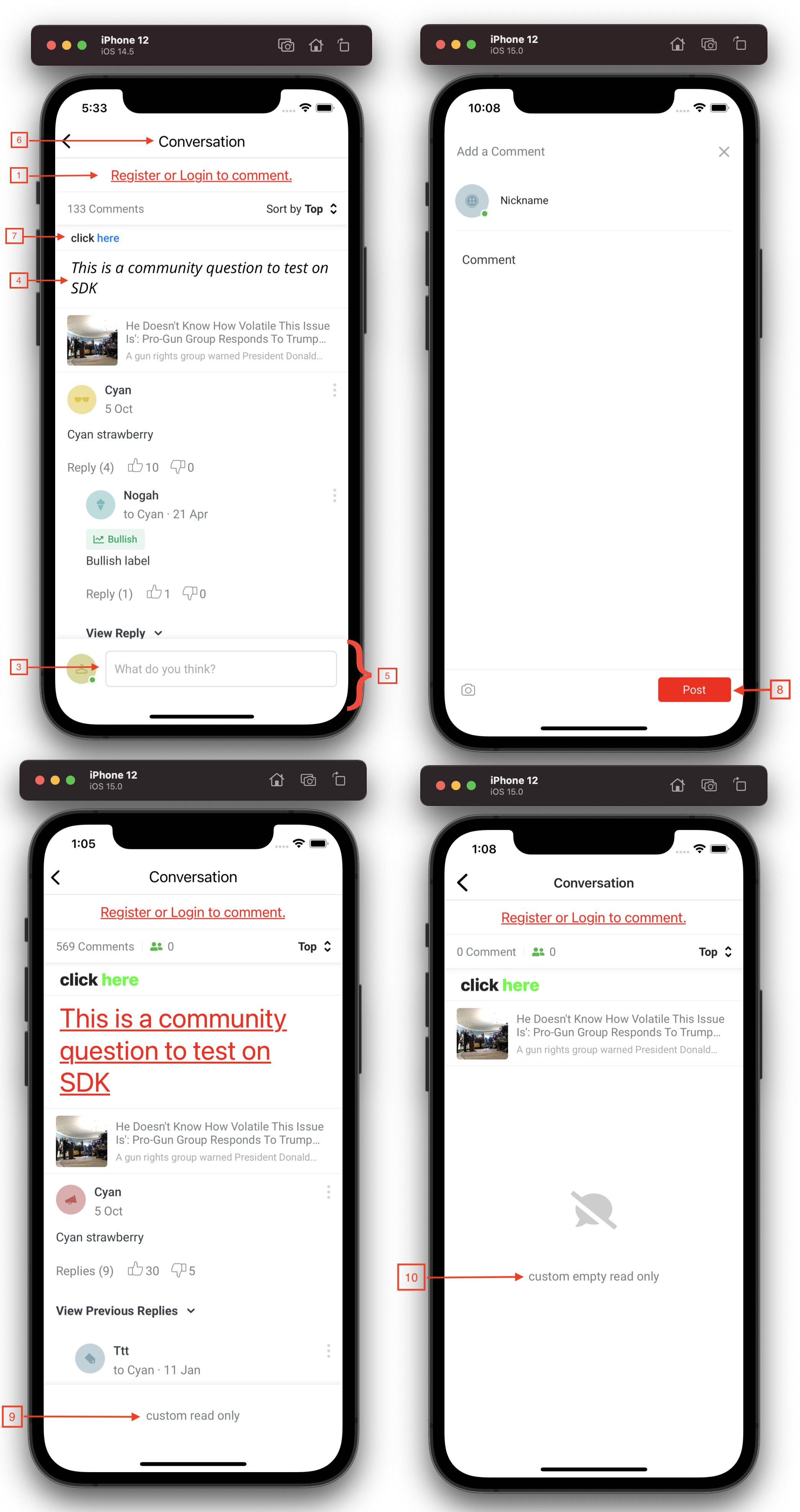
The SpotImCustomUIDelegate allows you full access to customize UI components, such as the login prompt, Conversation footer, navigation title, and more. Customizing different components enables you to adjust elements as if the UI were your own.


Use the following steps to configure UI components:
- Implement the
SpotImCustomUIDelegateprotocol.
extension ArticleViewController: SpotImCustomUIDelegate {
  func customizeView(view: CustomizableView, isDarkMode: Bool, source: SPViewSourceType?, postId: String) {
      switch view {
      case .loginPrompt(let textView):
          // set your own customization
          break
      // set more customizations to another CustomizableView
      default:
          break
      }
  }
}- In
SpotIm.createSpotImFlowCoordinator, set the SpotImCustomUIDelegate` to the coordinator.
SpotIm.createSpotImFlowCoordinator(loginDelegate: self) { result in
  switch result {
  case .success(let coordinator):
      self.spotIMCoordinator = coordinator
      coordinator.setCustomUIDelegate(delegate: self) // set the delegate
  }
}
SpotImCustomUIDelegate Reference
# | Component | CustomizableView |
|---|---|---|
1 | Login prompt |
|
3 | Say control in the Conversation (shown) or Pre-Conversation (not shown) |
|
4 | Community question |
|
5 | Footer |
|
6 | Navigation title |
|
7 | Community guidelines |
|
8 | Create Comment action button |
|
9 | Read-only label |
|
10 | Empty state read-only label |
|
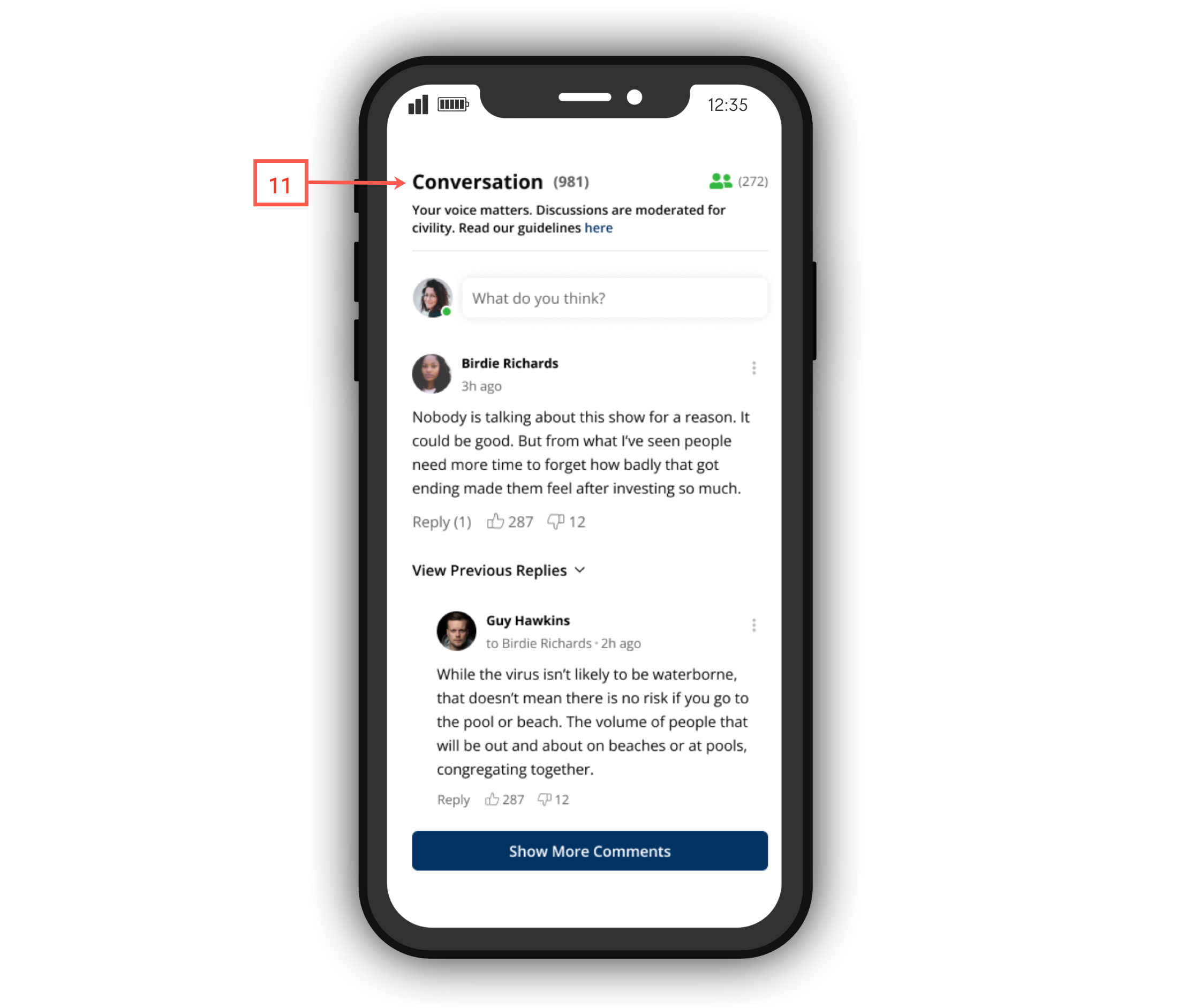
11 | Header |
|
Fonts
You can replace the OpenWeb iOS SDK's default fonts with your own custom fonts. Using custom fonts tailors the viewer experience to your brand.
Use the following steps to add custom fonts to your app:
- Add the custom fonts .ttf file to your app project for Bold, Medium, Regular, Italic, and Light styles.
- In the application-info.plist file, add the Fonts provided by application key in a new row.
- Add each .ttf file as a new item in the Fonts provided by application array.

- Run
print(UIFont.familyNames)inappDelegateto discover the corresponding required family name of the font (for example, Roboto). - From the
appDelegateimmediately afterSpotIM.initialize(), set theSpotIm.customFontFamilyproperty with the font family name.
SpotIm.initialize(spotId: "SPOT_ID")
//optional - set your custom font family name for example "Roboto"
SpotIm.customFontFamily = "Roboto"
Updated 5 months ago
