
Reactions ᴺᴱᵂ
The OpenWeb Android SDK provides a Reactions widget — a poll-style component where readers answer a question with a single tap and see how others voted, shown as per-option percentages and a total reaction count. A reader can tap their reaction again to undo the vote. Reactions is independent of the Conversation components, so you can embed it anywhere in your article layout, on its own or alongside a conversation.
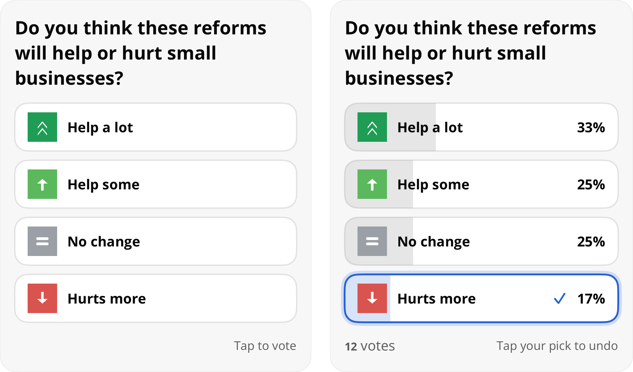
Reactions before and after voting
Requirements
- OpenWeb Android SDK 3.2.1 or later
spotIdconfigured during SDK initialization — see Getting Started- Reactions enabled for your spot by your Partner Success Manager (PSM)
Important: When Reactions is disabled for your spot, the widget stays hidden.
Components API
getReactions() on the OWUIComponents interface builds a reactions View that you add to your own layout. Retrieve the interface from the SDK manager:
val components: OWUIComponents = OpenWeb.manager.ui.componentsRequest the widget and add the returned View to a container:
components.getReactions(
    postId = "POST_ID",
    completion = object : SpotCallback<View>() {
        override fun onSuccess(view: View) {
            // Add the reactions view to your layout
        }
        override fun onFailure(exception: SpotException) {
            // Handle error
        }
    }
)
The view fills the width you give it and sizes its own height to its content.
Parameter notes:
postId— Identifies the content item the reactions belong to (String)themeName— Selects which reactions theme to display (String, defaults to"default")completion—SpotCallback<View>delivering the reactions view on success or aSpotExceptionon failure
Jetpack Compose
The optional spotim-compose module exposes a Reactions composable that renders the same widget in a composition. Add the module dependency as described on the Jetpack Compose page, then place the composable anywhere in your layout:
Reactions(postId = "POST_ID")Apply a Modifier and choose a theme the same way you would any composable:
Reactions(
    postId = "POST_ID",
    themeName = "sports",
    modifier = Modifier.fillMaxWidth()
)
Note: The composable renders nothing when the SDK is not initialized or Reactions is disabled for the spot.
Themes
A reactions theme defines the question and the set of reaction options. Themes are configured for your spot — contact your PSM to add or change them. Pass the theme's name in the themeName parameter to choose which one an article displays. When omitted, the "default" theme is used.
// Components API
components.getReactions(
    postId = "POST_ID",
    themeName = "sports",
    completion = reactionsCallback
)
// Jetpack Compose
Reactions(postId = "POST_ID", themeName = "sports")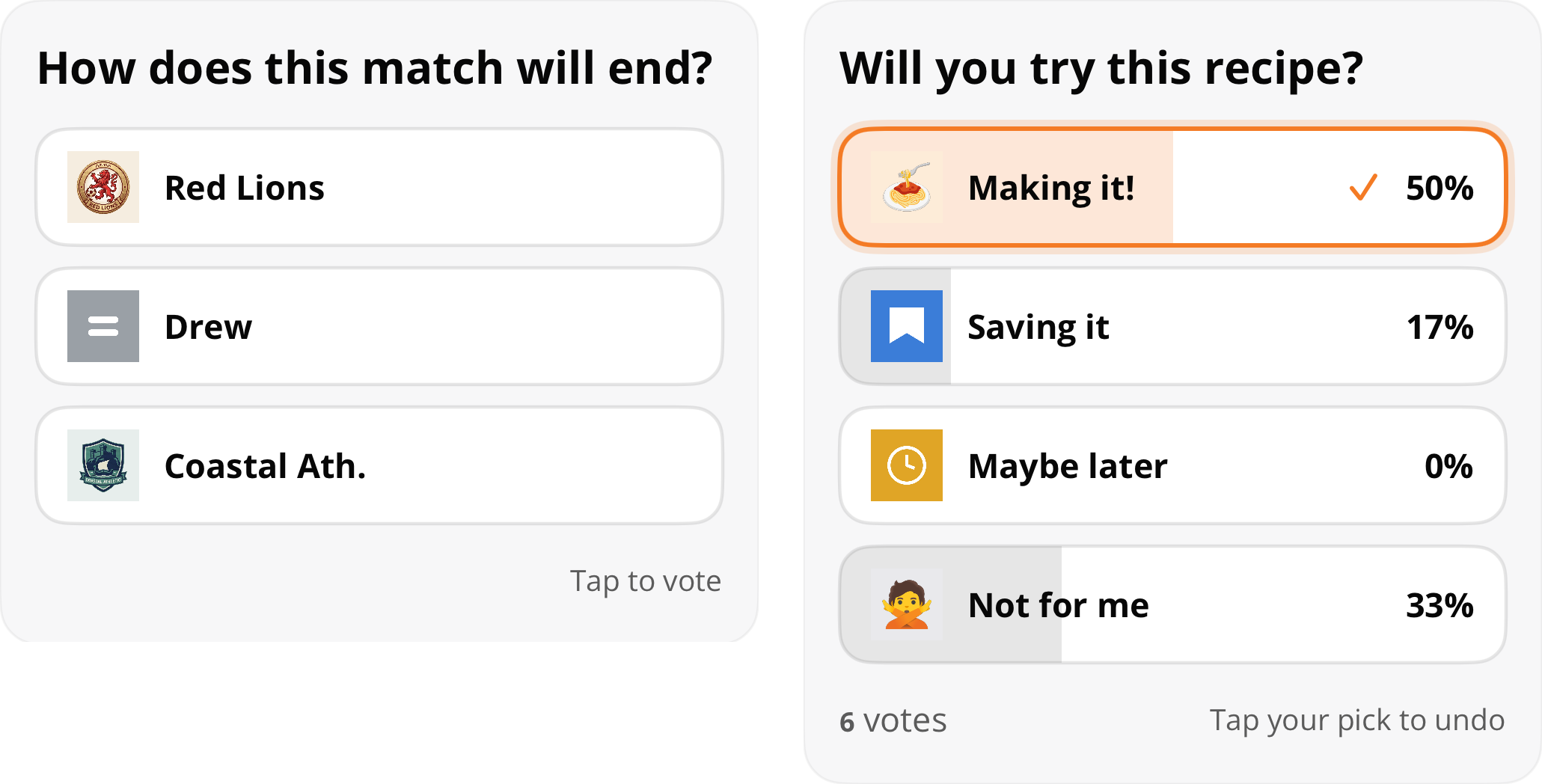
Two reactions themes with different questions and reaction options
NEW
Updated 2 months ago